Are you looking too give your WordPress site a fresh new look? One of the easiest ways to enhance your layout and improve readability is by adjusting your column widths. Whether you’re crafting a stunning blog post, setting up a portfolio, or designing a business website, the way your content is displayed can make a huge difference in user experience. if you’ve ever found yourself frustrated with the default settings or felt that your content is a little cramped, you’re not alone! In this beginner’s guide, we’ll walk you through the simple steps to change column widths in WordPress. By the end, you’ll not only have the skills to customize your layout, but you’ll also be able to create visually appealing pages that keep your readers engaged. Ready to transform your site? Let’s dive in!
Understanding the Importance of Column Width in WordPress Layouts
When designing a website, notably in a platform as flexible as WordPress, the width of your columns can greatly influence the overall visual appeal and functionality of your layout. Column width affects not only how content is displayed but also how users interact with it. A well-structured column layout can enhance readability,ensure proper spacing,and create a more engaging user experience.
Consider the following key factors when determining column width:
- Readability: Text that is too wide can overwhelm readers, while columns that are too narrow can break the flow of reading. Aim for a width that encourages comfortable reading.
- Content Hierarchy: Different columns can serve different purposes—like showcasing images, text, or calls-to-action. Adjusting the widths can help prioritize these elements effectively.
- Responsive Design: With the variety of devices used to access websites, maintaining column width that adapts to different screen sizes is crucial. Flexible widths can ensure that your site looks great on desktops, tablets, and smartphones.
To illustrate the impact of column width, let’s look at a simple comparison of two layouts:
| Layout type | Pros | Cons |
|---|---|---|
| Equal Width Columns | – Balanced appearance – Simplifies design process | – May limit content variety – Can appear monotonous |
| Variable Width Columns | – Highlights significant content – Adds visual interest | – requires careful planning – May confuse users if not clear |
Testing different column widths can lead to insights about what works best for your specific audience. Tools like the wordpress Customizer allow you to experiment with different layouts without breaking your site. As you make adjustments, observe user engagement metrics; tweaks in column width can lead to higher click-through rates and longer time spent on the page.
Ultimately, understanding and optimizing column width in your WordPress layouts is not just about aesthetics. it’s about crafting a seamless experience that guides users where you want them to go, enhances comprehension, and encourages interaction. A well-thought-out column layout can transform a standard blog post into a visually dynamic and user-friendly web page.
Getting Started with the WordPress Block Editor for Column Adjustments
Adjusting column widths in the WordPress Block Editor is a straightforward process that opens up a world of design possibilities for your content. Whether you’re aiming for a clean, minimalist look or a vibrant, multi-column layout, the Block Editor provides intuitive tools to help you achieve your vision.
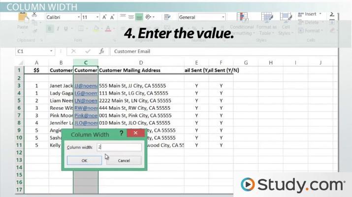
To get started, select the column block you want to modify.Once selected, you’ll notice a toolbar appears at the top. Here are some essential tips to remember:
- Drag and Drop: You can easily adjust the width of your columns by dragging the edges within the block. This allows for real-time adjustments as you see how your changes affect the layout.
- Block Settings: On the right sidebar, you’ll find settings specific to your column block. Here, you can set the percentage width for each column, ensuring they align perfectly with your design goals.
- Responsive Design: Keep in mind how your columns will look on different devices.The Block Editor allows you to customize settings for mobile view, ensuring usability across all platforms.
If you want to achieve more complex layouts, you can combine multiple columns with different widths. For example, a two-column layout where one column takes up 70% of the space while the other takes up 30% can be visually appealing and functional. Here’s a simple table showcasing some common column width combinations:
| Layout Type | Column 1 Width | Column 2 Width | |
|---|---|---|---|
| Standard | 50% | 50% | |
| Split Layout | 70% | 30% | |
| Triple Columns | 33% | 34% | 33% |
don’t forget to preview your changes frequently. Use the Preview button to see how your columns will appear to visitors. This step is crucial to ensure that your content remains visually appealing and easy to read. With these tools at your disposal,adjusting column widths in WordPress can be an enjoyable and rewarding experience!
Exploring Theme Options to Customize Your Column Width
When it comes to customizing your website’s appearance, adjusting the width of your columns can substantially enhance the user experience. Fortunately, most WordPress themes offer a variety of options that allow you to tailor the column width to suit your content needs. By diving into your theme settings, you can easily create a layout that not only looks appealing but is also functional.
Here are some methods to explore when customizing column width:
- Theme Customizer: Many themes come with a built-in customizer. navigate to Appearance > Customize and look for layout settings that let you adjust column widths with simple sliders.
- Page Builders: Tools like Elementor or WPBakery allow for greater adaptability. Drag and drop elements to your desired widths, providing a visual depiction of how your content will look.
- Custom CSS: If you’re comfortable with code, you can add custom CSS to define specific column widths. Use classes like
.columnand set widths using percentages or fixed measurements for a more tailored look.
If your theme supports it, you might also find options for predefined layouts. These frequently enough include multiple column configurations, such as:
| Layout Style | Description |
|---|---|
| 1-Column | great for showcasing single content pieces like a blog post or image. |
| 2-Column | Perfect for side-by-side comparisons or image galleries. |
| 3-Column | ideal for portfolios or product displays, allowing for a vibrant layout. |
Remember, while it’s tempting to go for narrow columns for a sleek look, readability should always come first. Test different widths on various devices to ensure that your content remains engaging and easy to digest. A responsive design will not only enhance user experience but can also contribute positively to your site’s search engine rankings.
Using Plugins to Easily change column Width in WordPress
For those looking to customize their WordPress site, adjusting column widths can significantly enhance your layout and usability. While many users may attempt to modify CSS directly, utilizing plugins can offer a more seamless and user-friendly approach. There are several plugins designed specifically for this purpose, allowing you to easily adjust column widths without having to dive deep into code.
Here are some popular plugins that make changing column widths a breeze:
- Elementor: This powerful page builder allows you to adjust column widths with a simple drag-and-drop interface, offering you complete control over your layout.
- WPBakery Page Builder: Known for its flexibility,this plugin provides intuitive options to modify column sizes,making it easy to create customized sections that fit your vision.
- Gutenberg Blocks: If you’re using the Gutenberg editor, numerous block plugins are available that extend the default capabilities, enabling you to set specific column widths with ease.
When choosing a plugin, consider the following factors:
| Plugin | User-Friendliness | customization Options |
|---|---|---|
| Elementor | Very Easy | High |
| WPBakery Page Builder | Moderate | High |
| Gutenberg Blocks | Easy | Moderate |
once you’ve selected a plugin, installing it is indeed typically straightforward. Navigate to your WordPress dashboard, go to the Plugins section, and search for your chosen plugin.After installation, you can find specific settings for adjusting column widths either within the plugin’s interface or while editing your pages.
Customization is where the magic happens! Make sure to explore the various options each plugin provides. You can frequently enough set widths as percentages or fixed sizes, allowing for responsive designs that look great on any device. The ability to preview changes in real-time also ensures that you can fine-tune your layout before making it live.
using plugins to change column widths not only simplifies the design process but also opens up a world of possibilities for creating visually appealing and functional layouts on your WordPress site. With just a few clicks, you can achieve the perfect look tailored to your content needs!
Mastering Custom CSS for advanced Column Width Adjustments
Adjusting column widths in WordPress can transform the layout of your site, allowing for a more personalized and visually appealing design. While many themes come with predefined column widths, mastering custom CSS provides the flexibility to create unique arrangements. To get started, you’ll need to familiarize yourself with the basic CSS properties that control width, particularly width and max-width.
Here are some essential tips to consider when using custom CSS for column adjustments:
- Identify the Column Selector: Use browser developer tools (Right-click > Inspect) to find the correct CSS selector for the column you want to modify.This could be a class like
.columnor an ID such as#my-column. - Set the Width: Use percentages for responsive designs. Such as:
.column {
    width: 50%; /* Adjusts the column to half the container width */
}
Flexbox Layouts: For advanced layouts, consider using Flexbox. this approach allows for dynamic and flexible layouts that adapt to screen sizes. Here’s a rapid example:
.container {
    display: flex;
}.column {
    flex: 1; /* Each column takes equal space */
}
when implementing custom styles,you might want to maintain uniform spacing. Utilizing margin and padding is crucial. As an example:
.column {
    margin: 10px; /* Adds space around each column */
    padding: 15px; /* Adds space inside each column */
}
For those looking to visualize adjustments, here’s a simple table that outlines common width settings and their effects:
| Width Setting | Resulting Layout |
|---|---|
| 25% | One quarter of the container |
| 50% | Half of the container |
| 75% | Three-quarters of the container |
| 100% | Full-width column |
always remember to test your changes across different devices. A responsive design is essential for providing an optimal user experience.By leveraging custom CSS, you can create a unique layout that not only enhances aesthetics but also improves functionality.
Mobile Responsiveness and Its Impact on Column Width
In today’s digital landscape, ensuring that your website is mobile-responsive is more crucial than ever. A significant factor in achieving this is the management of column width.When your columns are too wide or too narrow, it can detract from the overall user experience on mobile devices. this is why understanding how to adjust column width effectively is essential for any WordPress user.
When you’re working on a responsive design, consider how the content flows within different screen sizes. Here are a few points to keep in mind:
- Content Prioritization: On smaller screens, prioritize the most important content. Adjusting column widths can help highlight key facts without overwhelming the user.
- Readability: ensure that text is easily readable. Wider columns can lead to difficulty in reading, while overly narrow columns can break lines awkwardly.
- Visual Balance: Maintain a visually appealing layout. Well-proportioned columns create a harmonious look that enhances user engagement.
To achieve optimal column width on mobile devices, consider using CSS media queries. this allows you to set specific styles based on the screen size. As an example, you could have a wider column for desktops and a more compact version for smartphones:
/* CSS Example */
@media (max-width: 768px) {
    .column {
        width: 100%; /* Full width on mobile */
    }
}
Additionally, WordPress themes frequently enough come with built-in options to customize column settings.You can easily adjust these settings in the block editor or through your theme’s customizer.Here’s a simple table to illustrate common column width adjustments:
| Device Type | Recommended Column Width |
|---|---|
| Desktop | 50% – 100% |
| Tablet | 75% – 100% |
| Mobile | 100% |
By mastering these techniques for adjusting column width,you can significantly enhance your website’s mobile responsiveness. This will not only improve user experience but also positively impact your site’s SEO, leading to increased visibility and engagement. Embracing a mobile-first design approach is no longer optional; it’s a necessity for success in the online arena.
Troubleshooting Common Column Width Issues in WordPress
When customizing your wordpress site,you might encounter issues with column widths not displaying as expected. This can be frustrating, especially when you want your content to look perfect. Here are some common problems and solutions to help you troubleshoot these column width issues effectively.
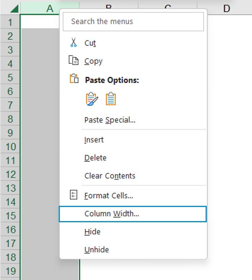
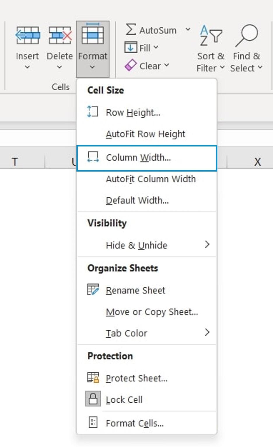
First, check your theme settings. Many WordPress themes come with built-in options to adjust column widths. Navigate to Appearance > Customize and look for sections related to layout or columns. Here are a few things to look out for:
- Content Width: Ensure that your content width is set correctly in the theme customizer.
- Sidebar Settings: If you have a sidebar,it might be affecting the main content area. Adjust the sidebar width to see if it resolves the issue.
If your theme settings seem fine, inspect the individual page or post. Sometiems, specific templates or blocks you use can override general settings. To do this, follow these steps:
- Open the page or post in the editor.
- Check the block settings on the right sidebar for any width adjustments.
- Look for any inline styles that might be restricting the width of specific columns.
If issues persist, consider whether custom CSS is affecting your layout. Sometimes,custom styling added to your site can inadvertently alter the expected column widths. To check this:
- Go to appearance > Customize > Additional CSS.
- Look for any width properties that might potentially be applied to columns or containers.
- Temporarily remove or comment out the custom CSS to see if it fixes the issue.
if you’re using a page builder plugin, ensure that the column settings within the builder are not conflicting with your theme’s settings. Here’s a simple table that summarizes common column settings you might find:
| Setting | Location | Notes |
|---|---|---|
| Content Width | Theme Customizer | default setting to control overall width. |
| Sidebar Width | Theme Customizer | Affects main content space if sidebars are used. |
| Block Settings | Page/Post Editor | adjust individual block widths as needed. |
| Custom CSS | Appearance > Customize | Can override default styles; check for conflicts. |
By systematically checking these areas,you can usually pinpoint the source of the column width issue and make the necessary adjustments. Don’t hesitate to experiment with settings until you find the perfect layout that fits your vision!

Tips for Achieving a Balanced Layout with Column Width
Achieving a balanced layout with column width is essential for creating a visually appealing and user-friendly website. When adjusting column widths in WordPress, consider the following tips to ensure your content flows seamlessly and engages visitors:
- Understand Your Content: Different types of content may require different column widths. For example, a blog post with long paragraphs might benefit from wider columns, while a product grid needs narrower columns to display multiple items effectively.
- Utilize the 12-Column Grid System: Many themes follow a grid layout that divides the screen into 12 equal columns. Use this system to create a harmonious balance.For instance, a two-column layout might use a 6:6 ratio, while a three-column layout could implement 4:4:4 to maintain symmetry.
- Experiment with Responsive Design: Always check how your columns appear on different devices. WordPress offers responsive design options,but you should manually adjust column widths to ensure they look good on mobile,tablet,and desktop screens.
- Use Visual Page Builders: Tools like Elementor or WPBakery Page Builder allow you to drag and drop elements, making it easier to visualize how your column widths will interact. Play around with the settings to see what looks best for your layout.
- Incorporate White Space: Don’t forget about the power of white space! Leaving breathing room between columns can enhance readability and create a more elegant appearance. Ensure your column widths leave enough space for padding and margins.
To illustrate the impact of different column widths, consider the following table that compares various layout options:
| Layout Style | column Widths | Best For |
|---|---|---|
| Single Column | 100% | Articles/Blogs |
| Two Columns | 50% – 50% | text + Image |
| Three Columns | 33% – 33% – 33% | Product listings |
| Wide Left Sidebar | 75% – 25% | Navigation + Content |
by applying these strategies, you can create a balanced layout that enhances user experience and keeps visitors engaged. take the time to experiment and adjust column widths until you find the perfect combination for your unique content and audience.
Best Practices for Consistent column Width Across Your Site
creating a visually appealing website is not just about the content; it’s also about ensuring that your layout is consistent and easy to navigate. One of the key elements of a polished website design is maintaining consistent column widths. Here are some tips to help you achieve this across your WordPress site:
- utilize a Grid System: Many themes come with built-in grid systems that automatically adjust column widths. Familiarize yourself with your theme’s grid settings to take advantage of this feature.
- Custom CSS: If your theme doesn’t provide adequate options, a little custom CSS can go a long way. Use CSS properties like
widthandmax-widthto define fixed or fluid column widths. For example:
.column {
    width: 100%; / for full width /
    max-width: 1200px; / for maximum width /
    margin: 0 auto; / to center the column /
}
Moreover, ensure your columns adapt seamlessly across different devices. Responsive design is essential, so consider using CSS media queries to adjust widths for mobile and tablet views. Here’s a simple example:
@media (max-width: 768px) {
    .column {
        width: 100%; / Full width on smaller screens /
    }
}
Another best practice is to maintain visual hierarchy.When columns are of varying widths, it can confuse visitors. Stick to a defined pattern (like 1/3 and 2/3 columns) and apply it throughout your site. This not only aids in navigation but also enhances the aesthetic quality of your pages.
| Column Layout | Use Case |
|---|---|
| 1/2 | Ideal for text and images side by side. |
| 1/3 + 2/3 | Great for feature highlights with detailed descriptions. |
| 1/4 + 3/4 | Perfect for sidebar content or widgets alongside main content. |
Lastly, always preview your changes before publishing. WordPress allows you to see how your layout looks on various devices, ensuring your column widths are consistent and professional before they go live.By following these practices, you’ll not only enhance the user experience but also establish a cohesive brand identity throughout your site.
Final Thoughts on Enhancing Your WordPress Design with Column Width Adjustments
Adjusting the column widths in your WordPress design can significantly impact the overall aesthetic and functionality of your website. It’s not just about aesthetics; it’s about enhancing user experience and making your content more approachable. A well-structured layout draws visitors in and encourages them to stay longer, ultimately leading to higher engagement rates.
Here are some practical tips to consider when tweaking your column widths:
- Understand Your Content: Before making adjustments, analyze the type of content you have. Some content types,like images or videos,may require wider columns for better visibility,while text-heavy sections might benefit from more narrow columns to improve readability.
- Utilize Responsive Design: Ensure that your column adjustments are mobile-friendly. With more users accessing websites via mobile devices, a responsive design that adapts to different screen sizes is essential.
- Experiment with Spacing: Adjusting column width is not just about their size but also their spacing. Proper padding and margins can create a balanced look that enhances the site’s overall feel.
To help visualize how different column widths can affect your layout, consider the following table showcasing potential configurations:
| Column Configuration | Use Case |
|---|---|
| 1 Column | ideal for full-width images or single-focus content. |
| 2 Columns | Great for side-by-side comparisons or related posts. |
| 3 Columns | Perfect for galleries or showcasing multiple items. |
| 4 Columns | Effective for product listings or portfolio items. |
Ultimately, the key to a successful WordPress design lies in the balance between form and function. By thoughtfully adjusting your column widths, you can create a layout that not only captures attention but also enhances usability. Don’t hesitate to experiment with different configurations until you find the perfect fit for your site. Remember, the goal is to create an inviting space that encourages exploration and engagement.
Frequently Asked Questions (FAQ)
Q&A: How to Change Column Width in WordPress (Beginner’s Guide)
Q: Why should I care about changing column widths in WordPress?
A: Great question! Column widths can significantly impact the readability and overall aesthetics of your website.A well-structured layout enhances user experience, making it easier for visitors to engage with your content. Plus, it helps maintain a professional appearance, which can increase trust and credibility for your brand!
Q: Is changing column width difficult? I’m a total beginner!
A: Not at all! Changing column widths in wordpress is easier than you might think. With just a few simple steps, you can customize your layout without needing to know any coding. We’ve broken it down in our guide,so you can follow along and make your site look exactly how you want it!
Q: Do I need to use a specific theme to change column widths?
A: While many themes offer flexible column settings,some might have more limitations than others.However, most modern themes are designed to be user-friendly and customizable. If you run into restrictions, you might consider using page builders like Elementor or WPBakery, which provide even more control over your layouts and column widths!
Q: Can I change column widths in block editors like Gutenberg?
A: absolutely! Gutenberg, WordPress’s block editor, makes it super simple to adjust column widths. You can use the Column block to create your layout and then easily customize the width of each column in the settings panel. It’s intuitive and allows for real-time adjustments, so you can see how it looks as you go!
Q: What if I want more advanced control over my columns?
A: If you’re looking for more advanced customization, using custom CSS is a great option. Adding a few lines of code can give you fine-tuned control over your column widths and overall layout. Don’t worry—it sounds intimidating,but many resources are available to help you learn the basics!
Q: Will changing column widths affect mobile responsiveness?
A: It can,but that’s part of the beauty of WordPress! Most themes are designed with responsive design in mind,meaning your columns will adjust based on the screen size. However, it’s always a good idea to check how your columns look on mobile devices after making changes. You want to ensure a seamless experience for all users!
Q: Are there any plugins that can help with column widths?
A: Yes,indeed! There are several plugins available that can enhance your ability to customize layouts.Plugins like Elementor, WPBakery, or Beaver Builder offer drag-and-drop functionality and pre-built templates, making it even easier to adjust column widths and create stunning pages without any coding knowledge!
Q: What’s the first step I should take to start changing column widths today?
A: Dive right in! Start by exploring your WordPress dashboard and familiarize yourself with the block editor or your theme’s page builder. Create a new post or page, insert a column block, and experiment with the width settings. Don’t hesitate to refer back to our guide for specific instructions—it’s all about practice, so the more you play around, the more confident you’ll become!
Q: Any final tips for someone new to WordPress?
A: Absolutely! remember, the key is to keep it simple and not overwhelm yourself. Take it one step at a time, and don’t hesitate to experiment. WordPress is designed to be user-friendly, so have fun with it! And always back up your site before making significant changes—just in case!
—
Now that you have all the info you need, it’s time to roll up your sleeves and start customizing! Your website is a reflection of you, so make it shine with the perfect column widths!
In Conclusion
Conclusion
And there you have it! Changing column widths in WordPress doesn’t have to be a daunting task. With just a few simple steps,you can enhance the layout of your site and make your content shine. whether you’re looking to create a more visually appealing blog post or need to optimize your site’s design for better user experience, mastering column widths is a game changer.
So, why wait? Dive into your WordPress dashboard and start experimenting with those column settings! Remember, a well-organized layout not only grabs attention but also keeps your readers engaged. If you found this guide helpful,don’t hesitate to share it with fellow WordPress users or leave a comment below. We’d love to hear about your experiences or any tips you’ve discovered along the way!
Happy customizing, and here’s to creating a stunning website that reflects your unique style!