Unlocking the Power of Hero Images: The Sizes You Need to Know
Hey there! If you’re diving into the world of web design or digital marketing, you’ve probably heard about the importance of hero images. But let’s be honest—navigating through the endless size specifications can feel like trying to solve a Rubik’s Cube blindfolded. Fear not! In this article, we’re going to break down everything you need to know about hero image sizes so you can make your visuals pop and grab your audience’s attention. Whether you’re crafting a stunning website, creating an eye-catching landing page, or sprucing up your social media, the right hero image size is crucial. So, let’s simplify this together and unlock the full potential of your projects! Ready? Let’s jump in!
Understanding the Importance of Hero Images in Web Design
Hero images serve as a powerful visual element that captures the attention of visitors right from the moment they land on a website. These large, striking images not only enhance the aesthetic appeal of a site but also convey its message effectively. The right hero image can evoke emotions, create a memorable frist impression, and guide users towards your desired action, whether it’s making a purchase, signing up for a newsletter, or exploring more content.
When choosing the size for your hero images, it’s crucial to consider various devices and screen resolutions. A well-optimized hero image looks great on desktops, tablets, and smartphones. Here are some common sizes to keep in mind:
- Full-width hero images: Typically around 1920px wide, ensuring they stretch across the screen for a dramatic effect.
- Mobile hero images: Generally around 768px wide, designed specifically for smaller screens to maintain clarity and focus.
- Aspect ratios: Commonly used ratios include 16:9 and 4:3, which help maintain visual balance.
Moreover,the loading speed of your hero images plays a vital role in user experience.Images that are too large can slow down your site,leading to higher bounce rates. It’s essential to compress your images without compromising quality. Tools like TinyPNG or ImageCompressor can be incredibly useful in this regard.
| Device Type | Recommended Size | Aspect Ratio |
|---|---|---|
| Desktop | 1920px x 1080px | 16:9 |
| Tablet | 768px x 1024px | 4:3 |
| mobile | 375px x 667px | 16:9 |
hero images are more than just decorative elements; they are critical components that influence a website’s functionality and user engagement. By selecting the appropriate size and optimizing for performance, you can leverage hero images to create an impactful online presence that resonates with your audience.
The Ideal Hero Image Size for Different Devices
When designing your website, the hero image is one of the most prominent elements that can either captivate or repel your visitors. ensuring that your hero image is the right size for each device is crucial for maintaining visual appeal and functionality. Here’s a breakdown of the ideal hero image sizes tailored for various devices:
| Device | Ideal Size (px) | Aspect Ratio |
|---|---|---|
| Desktop | 1920 x 1080 | 16:9 |
| Tablet | 768 x 1024 | 4:3 |
| Mobile | 375 x 667 | 9:16 |
| Large Screens | 2560 x 1440 | 16:9 |
For desktop users, the larger screen real estate allows for high-resolution images that can fill the entire width of the browser window.A size of 1920 x 1080 pixels is ideal, maintaining a 16:9 aspect ratio. This size ensures that details are sharp, giving your website a professional feel that engages users.
when it comes to tablets, the dimensions shift slightly due to the different orientation and size. An ideal hero image would be 768 x 1024 pixels, benefiting from a 4:3 aspect ratio. This size captures the essence of your content while allowing for text overlays without compromising readability.
For mobile devices, where screen space is at a premium, a size of 375 x 667 pixels is frequently enough sufficient, with a 9:16 aspect ratio. A well-optimized image here is crucial, as it should still be striking while ensuring fast load times. Remember, mobile users are often looking for immediate information, so the hero image must complement your message without overwhelming them.
Lastly, for large screens or high-resolution displays, consider using images of 2560 x 1440 pixels. This size retains clarity and detail, rounding out a seamless experience across all devices. As web design continues to evolve, keeping these specifications in mind will ensure that your hero image always looks its best, captivating your audience from the moment they land on your site.
How to Optimize Your Hero Images for Faster Loading
When it comes to hero images, quality should never be sacrificed for speed. However, optimizing these images can dramatically improve your website’s loading time without compromising their stunning visuals. Here are some strategies to ensure your hero images load quickly:
- choose the Right Format: Use JPEG for photographs,PNG for graphics with clear backgrounds,and SVG for logos and icons. Each format serves a unique purpose and can considerably affect loading speed.
- Compress Images: Utilize tools like TinyPNG or ImageOptim to compress your images without losing quality. This reduces file size and enhances loading speed.
- Implement Responsive Images: Use the
srcsetattributes to serve different image sizes based on the device. This ensures that mobile users aren’t downloading large files unnecessarily. - Lazy Load Images: incorporate lazy loading to delay the loading of off-screen images until the user scrolls down. This not only speeds up initial loading time but also reduces bandwidth usage.
Understanding how hero images impact your site performance is crucial. To better illustrate this, here’s a quick comparison of various image formats and their typical attributes:
| image Format | Best Use | File Size (approx.) |
|---|---|---|
| JPEG | Photographic images | Low to Medium |
| PNG | Graphics with transparency | Medium to High |
| SVG | Logos and illustrations | Very Low |
Don’t forget about SEO! Use descriptive file names and alt text that captures the essence of your hero image.This not only helps with loading times but also improves your site’s visibility on search engines. A well-optimized hero image can engage users and encourage them to stay longer on your site.
keep an eye on your image dimensions. Uploading images that are larger than necessary can slow down your site significantly. Aim for the optimal size for different devices; a hero image of around 1200px wide usually does the trick for most desktops, while mobile versions might benefit from a max width of 600px. Taking these steps ensures that your visuals shine while your site remains speedy.
Choosing the Right Aspect Ratio for Maximum Impact
When it comes to utilizing hero images effectively, the aspect ratio can play a pivotal role in enhancing visual appeal and engagement. Choosing the right aspect ratio not only affects how your image is displayed but also influences user experience and layout consistency across different devices. Here are key considerations to keep in mind:
- Common Aspect Ratios: Familiarize yourself with the most popular aspect ratios such as 16:9, 4:3, and 1:1.Each ratio serves different purposes; for example, 16:9 is ideal for widescreen displays, making it perfect for videos and cinematic imagery.
- Device compatibility: Think about how your hero image will appear on various devices. A responsive design ensures that your content looks great on desktops,tablets,and smartphones. Utilizing a flexible aspect ratio like 4:3 can provide better adaptability across screen sizes.
- User Attention: The first impression is everything! A striking aspect ratio can draw users in and keep their attention. A taller image (like 3:2) is beneficial for storytelling or showcasing products, while a wider image can capture expansive landscapes or group scenes effectively.
To further aid your decision, consider the following table that illustrates aspect ratios and their ideal use cases:
| Aspect Ratio | Best For |
|---|---|
| 16:9 | Videos, Cinematic Images |
| 4:3 | Presentations, General Images |
| 1:1 | Social Media Posts, Product Images |
| 3:2 | Photography, Portfolio Displays |
Ultimately, the aspect ratio you choose should align with your brand’s message and the story you want to convey. By understanding the impact of different ratios on user engagement, you’ll be better equipped to make choices that resonate with your audience. Remember, a well-selected aspect ratio not only enhances the aesthetic value but also reinforces your brand identity.
Best Practices for Text Overlay on Hero Images
When it comes to hero images, ensuring your text overlay is effective is crucial for capturing your audience’s attention. to achieve this, consider the following best practices:
- Contrast matters: Ensure there is a strong contrast between the text and the image. Light text on a dark background or vice versa enhances readability.
- Font Size: Use a large, legible font size that stands out. A minimum of 24px is often recommended for optimal visibility.
- Text Placement: Position text in areas of the image that feature less detail. this ensures that your message isn’t lost in the visuals.
- Use White Space: Don’t overcrowd your hero image with too much text.A little white space can help draw attention to your message.
- Limit the Word Count: Aim for brevity. A few impactful words can often resonate more than lengthy sentences.
Another effective strategy is utilizing a subtle overlay or background color behind your text. This can enhance readability without obscuring the image. A semi-transparent overlay can create a unified look while allowing the hero image to shine through. Use a color that complements your overall design palette to maintain visual cohesion.
Additionally, consider the use of typography. Selecting a font style that aligns with your brand identity is key. As an example, a modern sans-serif may exude a contemporary feel, whereas a serif font might convey tradition and reliability. Make sure to maintain consistency across your website to reinforce brand recognition.
| Text Style | Effect |
|---|---|
| Bold | Draws attention and emphasizes important points |
| Italic | Adds a personal touch and can indicate subtlety |
| Uppercase | Creates urgency and is often used for calls to action |
Lastly, always test your hero images and text overlays across different devices and screen sizes.Responsive design is paramount, as what looks great on a desktop may not translate well to a mobile device. Use tools to preview how your text overlay appears on various platforms, ensuring a seamless experience for all users.
Creating Responsive Hero Images for a seamless Experience
When designing a website, the hero image is often the first thing visitors see, making it a critical element for engaging your audience. To ensure a seamless experience across various devices, it’s essential to create responsive hero images that adapt to different screen sizes. this not only enhances visual appeal but also improves usability,keeping users engaged and encouraging them to explore further.
To achieve this, consider the following tips:
- Use High-Quality Images: Always start with high-resolution images that look sharp on all devices, especially retina displays.
- Choose the Right aspect Ratio: Common ratios like 16:9 or 4:3 work well for hero images, striking a balance between aesthetics and functionality.
- Implement CSS Techniques: Utilize CSS properties such as
background-size: cover;to ensure your image fills the space without distortion. - Leverage Media Queries: Use media queries to specify different images or styles for various screen sizes,allowing for better optimization.
Additionally, it’s crucial to consider the loading speed of your hero images. Large files can slow down your site, which can lead to high bounce rates. Here’s a quick guide to image formats and their ideal use cases:
| Image Format | Best Use Case | Pros | Cons |
|---|---|---|---|
| JPEG | photographic images | Good compression, retains quality | Not great for transparency |
| PNG | Images with transparency | High quality, supports transparency | Larger file sizes |
| SVG | Logos and icons | Scalable without loss of quality | Limited color support |
always test your hero images across multiple devices and browsers to ensure they are displayed correctly. Regularly updating and optimizing your hero images can further enhance your website’s performance and user experience. Remember, a well-implemented hero image not only captivates but also guides your visitors through their journey on your site.
Common Mistakes to Avoid with Hero Image Sizing
When it comes to hero images, sizing can make or break your web design. One of the most common mistakes is using an image that isn’t optimized for various screen sizes. Responsive design is crucial, and failing to account for how your image will appear on different devices can lead to a poor user experience. Always ensure your hero images adapt gracefully to mobile, tablet, and desktop views.
Another pitfall is neglecting to consider the file size of your images. large hero images can significantly slow down your website’s loading time, which not only frustrates visitors but can also negatively impact your SEO rankings. Aim for the right balance between quality and size. Tools like ImageOptim or TinyPNG can help compress your images without sacrificing quality.
it’s also essential to maintain aspect ratios. Using a hero image that is cropped or distorted can detract from your brand’s professionalism. Make sure to use images that retain their integrity across different screen sizes. A good rule of thumb is to use a standard aspect ratio, such as 16:9 or 4:3, which is widely accepted and looks great on most devices.
| Aspect Ratio | Common Usage |
|---|---|
| 16:9 | Video content, full-width hero images |
| 4:3 | Photography, Traditional displays |
| 1:1 | Social media posts, Gallery images |
Lastly, don’t forget about the text overlay on your hero images. If your text is difficult to read due to poor contrast or incorrect sizing, it can confuse visitors or drive them away. Always test the readability of your overlay text by adjusting the size and color until it stands out clearly against the image backdrop.

Harnessing the Power of High-Quality Images
In the world of digital media, the impact of high-quality images cannot be overstated. Whether you’re designing a website, crafting a blog post, or creating a social media campaign, the right hero image can make or break your message.High-quality visuals capture attention, evoke emotions, and communicate your brand’s story in a way that text alone cannot. To fully leverage this power, understanding the appropriate sizes for your hero images is crucial.
Here are some key benefits of using high-quality images:
- Enhanced engagement: Stunning visuals are more likely to catch the eye of your audience, increasing the chances they will interact with your content.
- Improved brand perception: Professional and polished images convey trustworthiness and quality, reflecting well on your brand.
- Better SEO performance: Properly optimized images can boost your website’s search engine rankings, driving more organic traffic.
When it comes to hero images, size matters. Using the wrong dimensions can lead to pixelation or distortion,detracting from the overall aesthetic of your site. Here’s a quick reference table to help you choose the right dimensions for various platforms:
| Platform | Recommended Size |
|---|---|
| Website Hero Image | 1920 x 1080 px |
| Blog Header Image | 1200 x 628 px |
| Facebook Cover Photo | 820 x 312 px |
| Instagram Post | 1080 x 1080 px |
To ensure your images are as effective as possible, consider the following tips:
- Optimize for loading speed: Large images can slow down your site, so always compress them without losing quality.
- Use relevant visuals: Choose images that align with your message or product, enhancing your overall narrative.
- Test different variations: Experiment with different sizes and styles to see what resonates best with your audience.
By thoughtfully selecting and utilizing high-quality images, you can create a more dynamic, appealing, and effective online presence. Remember, each visual element you choose contributes to the story you’re telling, so make sure it’s a story worth sharing.
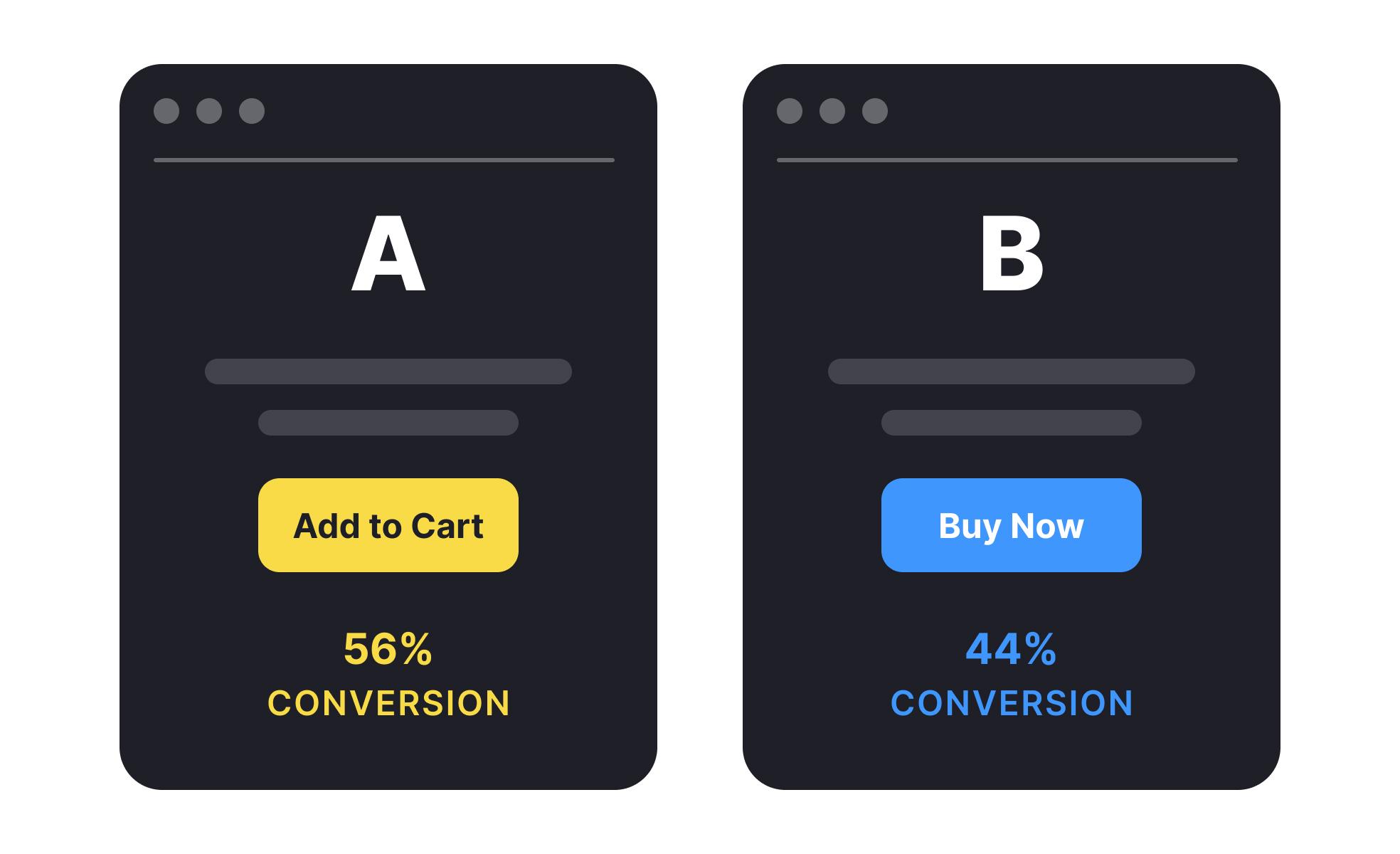
Leveraging A/B Testing to Perfect Your Hero Image
When it comes to optimizing your website’s hero image,A/B testing emerges as a powerful tool in your arsenal. This method allows you to experiment with different visuals, layouts, and content to determine which combination resonates best with your audience. By methodically testing variations, you can uncover valuable insights that lead to higher engagement and conversion rates.
To effectively leverage A/B testing for your hero image,consider the following steps:
- Define Your goals: Are you aiming to increase click-through rates,boost sign-ups,or enhance overall user engagement? Establishing clear objectives will guide your testing process.
- Choose Key Variables: Select elements to test such as image type (photography vs. illustrations), text placement, or color schemes. Each variable can significantly impact user perception and behavior.
- Segment Your Audience: Tailor your tests according to audience segments. Different demographics may respond differently to the same visual elements.
Once you have your variations set, utilize a robust testing platform to run your experiments. Monitor key performance indicators like bounce rate, time on page, and conversion rate to assess which hero image performs best. A/B testing gives you the ability to make data-driven decisions,ensuring that your design choices are not just based on intuition but grounded in real user feedback.
Here’s a quick overview of how different hero image sizes might perform with varying audiences:
| Hero Image Size | ideal For | Expected Impact |
|---|---|---|
| Full-width | landing Pages | Higher engagement, immersive experience |
| Fixed-size | Blogs and Articles | Consistent layout, better readability |
| Responsive | E-commerce | Increased conversions across devices |
Ultimately, A/B testing your hero image is not a one-time effort but an ongoing process. As user preferences and trends evolve, keeping your tests fresh will allow your website to stay relevant and appealing. Remember, the goal is not just to find a winner but to continuously refine your approach, ensuring that your hero image effectively captures your audience’s attention.
Final Thoughts on Crafting the Perfect Hero Image
Crafting the perfect hero image is more than just selecting a stunning photo; it’s about understanding the nuances that make it effective for your audience. When you get it right, a hero image can convey the essence of your brand, evoke emotions, and drive user engagement. Here are some key elements to consider:
- Clarity and Focus: Your hero image should have a clear focal point. Avoid clutter and distractions that could pull the viewer’s attention away from your main message.
- Relevance: Ensure that your image aligns with your content and resonates with your audience’s interests and needs. A relevant image reinforces your message and enhances user experience.
- Quality and Resolution: Use high-quality images that are sharp, vibrant, and professional. Blurry or pixelated images can undermine your credibility.
Additionally, consider the size and layout of your hero image. different platforms and devices may require different dimensions. Here’s a quick reference table for common hero image sizes:
| Device/Platform | Recommended Size |
|---|---|
| Desktop | 1920 x 1080 pixels |
| Tablet | 1280 x 800 pixels |
| Mobile | 375 x 667 pixels |
| Website Header | 1600 x 600 pixels |
Remember to also pay attention to the text overlay. It should be legible and complement the image rather than compete with it. Consider using contrasting colors and appropriate fonts that match your brand identity. Experiment with positioning and spacing to find the perfect balance.
Lastly, don’t underestimate the power of A/B testing. Try different images, layouts, and text combinations to see what resonates best with your audience. By continuously analyzing the performance of your hero images, you’ll be able to refine your approach and maximize engagement over time.
Frequently Asked Questions (FAQ)
Q: What exactly is a hero image?
A: Great question! A hero image is a large, eye-catching visual that sits at the top of a webpage, usually spanning the full width.It’s designed to grab attention and convey the essence of what a site is about. Think of it as the marquee for your website—it should be striking and compelling!
Q: Why is the size of a hero image so important?
A: The size is crucial because it affects both aesthetics and functionality. A well-sized hero image ensures your content doesn’t get distorted or pixelated, which can detract from the professional look of your site. Plus, the right size helps with loading times—too large and your page slows down, driving visitors away!
Q: So, what are the common hero image sizes I should know about?
A: Excellent question! Here are a few standard sizes to consider:
- Desktop: Typically around 1920 x 1080 pixels.This size looks great on most screens and allows for high-resolution displays without losing clarity.
- Mobile: For mobile devices, aim for about 750 x 1334 pixels. Mobile users are a meaningful portion of web traffic, so optimizing for them is key!
- Full-Width: If your design is full-width, a size of 2048 x 1152 pixels can be ideal for stunning visuals that draw in users right away.
Q: what about aspect ratios? Are they critically important too?
A: Absolutely! The aspect ratio helps maintain the visual integrity of your image across different devices. A common aspect ratio for hero images is 16:9, which is perfect for widescreen displays. Sticking to a consistent aspect ratio helps ensure your images look good no matter where they’re viewed!
Q: How can I choose the best size for my hero image?
A: Start by considering your audience and the devices they use. Use analytics to see what devices are most popular among your visitors. Then, test various sizes to see what resonates best without compromising quality. Don’t forget to optimize images for speed—tools like TinyPNG can help!
Q: Should I worry about SEO when it comes to hero images?
A: Definitely! Search engines love optimized images. Use descriptive file names and alt text to enhance SEO. This not only helps with rankings but also makes your site more accessible to all users. Plus,images that load quickly can improve your overall site performance,which is another ranking factor!
Q: Any final tips for creating an effective hero image?
A: Sure thing! Keep it simple—don’t clutter your hero image with too much text or too many elements. Make sure the main message is clear and visually appealing. Lastly, always test how it looks on different devices! A compelling hero image can be a powerful tool to draw users in and keep them engaged. So take the time to get it right!
Closing Remarks
as we wrap up our deep dive into hero image sizes, it’s clear that the right dimensions can make all the difference in creating an engaging user experience. Remember, a well-optimized hero image not only captures attention but also enhances your site’s aesthetics and functionality. Whether you’re designing for desktop, tablet, or mobile, keeping these sizes in mind will ensure your visuals always shine.
So, before you hit that publish button on your next project, take a moment to double-check your hero images.The right size can boost your site’s performance,improve loading times,and ultimately,help keep your visitors engaged and coming back for more.
Now that you’re armed with all the hero image knowledge you need, it’s time to put it into action! Don’t just take our word for it—try out these sizes and see the difference they can make. Your audience deserves the best, and with the right hero images, you’ll be one step closer to delivering just that. Happy designing!