How to Add a Hero Image With CSS: A Step-by-Step Guide
Have you ever landed on a website that instantly grabs your attention with a stunning visual? That captivating first impression is often the result of a well-placed hero image. If you’re looking to elevate your website’s design and make a memorable impact on your visitors, adding a hero image is a game-changer. But don’t worry if you’re not a coding expert; with a little guidance, you can master this essential web design technique using just CSS.
In this article, we’ll walk you through the simple steps to create and implement a hero image that not only enhances your site’s aesthetic appeal but also draws your audience in. Whether you’re a budding entrepreneur, a blogger, or just someone passionate about web design, you’ll discover how easy it is to transform your webpage into a visually striking experience. So, let’s dive in and unlock the potential of your website with a stunning hero image!
Understanding the Power of a Hero Image for Your Website
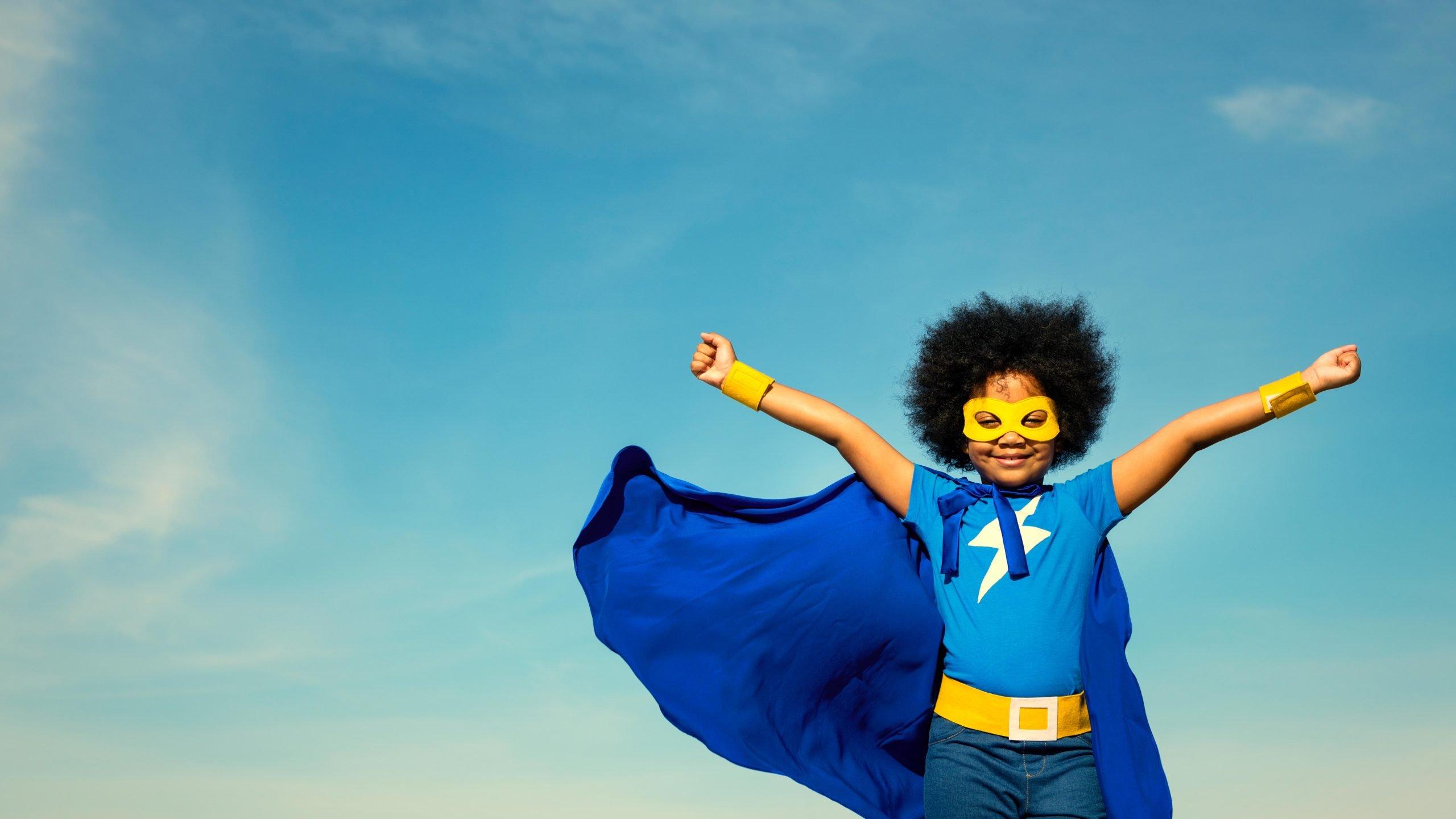
A hero image serves as a captivating visual anchor for your website, instantly drawing visitors into your content. This large, prominent image typically spans the width of the screen and can be paired with text or call-to-action buttons, creating an engaging user experience. By strategically using a hero image, you can effectively convey your brand’s message and evoke emotional responses from your audience.
When choosing a hero image, consider the following factors:
- Relevance: ensure the image aligns with your content and resonates with your target audience.
- quality: Use high-resolution images that look great on all devices to maintain a professional appearance.
- Emotion: Select images that evoke the right feelings to create a strong connection with your visitors.
- Branding: Incorporate elements that reflect your brand identity, such as colors, style, and themes.
Implementing a hero image with CSS is straightforward and can enhance the visual appeal of your website. below is a simple CSS code snippet to create a full-width hero image:
.hero {
    background-image: url('your-image-url.jpg');
    height: 100vh;
    background-size: cover;
    background-position: center;
    position: relative;
}
.hero h1 {
    color: white;
    text-align: center;
    position: absolute;
    top: 50%;
    left: 50%;
    transform: translate(-50%, -50%);
}
By applying the CSS above, your hero image will take up the full viewport height and maintain its aspect ratio, ensuring it looks great across various devices. You can easily overlay text or buttons for your calls to action, making your content more engaging and encouraging user interaction.
To further enhance your hero image section, consider adding a simple table to present key information or features related to your offerings:
| Feature | Description |
|---|---|
| High Quality | Stunning visuals that capture attention. |
| Responsive Design | Looks great on desktop and mobile devices. |
| Emotional Connection | Builds rapport with your audience. |

Choosing the Right Image to Make a Lasting Impression
When it comes to creating a striking hero image, the choice of visual is paramount. A hero image serves as the first point of contact for visitors, setting the tone for the entire site. Therefore,selecting an image that resonates with your brand identity is crucial. Consider the following factors:
- Relevance: Choose images that are directly related to your content or message. This creates a cohesive experience for users.
- Quality: high-resolution images are essential. Blurry or pixelated visuals can considerably undermine your brandS credibility.
- Emotion: Images that evoke an emotional response can connect with your audience on a deeper level, increasing engagement.
In addition to these factors, ensure the image complements your website’s overall color scheme and design. A well-matched color palette not only enhances aesthetic appeal but also improves readability. It’s advisable to use tools like Coolors to explore color combinations that can align your hero image with the rest of your site.
To visualize how different images can affect user perception, consider the following table that compares potential hero image themes:
| theme | Emotional Impact | Best for |
|---|---|---|
| Nature | Calmness | Health & Wellness |
| Urban Life | Excitement | Fashion & Lifestyle |
| Abstract | Curiosity | Technology & Innovation |
Lastly, don’t forget about accessibility—select images that can be easily understood, and consider adding descriptive alt text. This not only aids SEO but ensures that users with visual impairments can appreciate your content. by thoughtfully choosing an image that aligns with your brand and engages your audience,you set the stage for a more impactful user experience.
Optimizing Your Hero Image for Faster Load times
When it comes to enhancing the visual appeal of your website,a hero image can make a world of difference. Though, if that image takes too long to load, it can frustrate users and lead to higher bounce rates. To ensure your hero image serves its purpose without hindering performance, consider implementing these optimization strategies:
- Choose the Right Format: Utilize image formats that balance quality and size. For photographs, use JPEG; for graphics with transparency, consider PNG; and for animations, opt for GIF or modern formats like WebP.
- Compress your Images: Utilize tools like TinyPNG or imageoptim to reduce file size without sacrificing quality. This is crucial for faster load times.
- Implement Lazy Loading: This technique allows images to load only when they come into the viewport, improving initial load times and overall performance.
- use Responsive Images: Implement the
srcsetattribute to serve different image resolutions based on the user’s screen size, ensuring that mobile users are not downloading unnecessarily large files.
Another essential aspect of hero image optimization is employing proper CSS techniques to enhance loading efficiency. Consider using the following CSS properties:
| CSS Property | Description |
|---|---|
background-image | Use this to set your hero image as a background, wich can be loaded more efficiently. |
background-size: cover; | This ensures your image covers the entire hero section without distortion. |
opacity | Apply this to achieve a smooth loading effect, making the image gradually appear as it loads. |
Lastly,always test your page’s loading speed using tools like Google PageSpeed Insights or GTmetrix. These platforms provide insights into how your hero image affects overall performance and suggest actionable improvements. By prioritizing optimization, you not only enhance user experience but also contribute positively to your site’s SEO.
Crafting the Perfect CSS for stunning Visuals
Creating a stunning hero image using CSS can elevate your website’s aesthetic and draw visitors in. To achieve a visually striking hero section, focus on the following elements:
- Image Selection: Choose high-resolution images that resonate with your brand message.
- Overlay Effects: Implement overlays to enhance text readability while adding depth.
- Responsive Design: Ensure your hero image looks great on all devices, adjusting its size and position accordingly.
Here’s a simple CSS snippet to create an eye-catching hero image:
        .hero {
            background-image: url('path-to-your-image.jpg');
            height: 100vh;
            background-size: cover;
            background-position: center;
            position: relative;
        }
        .overlay {
            position: absolute;
            top: 0;
            left: 0;
            right: 0;
            bottom: 0;
            background-color: rgba(0, 0, 0, 0.5);
            display: flex;
            justify-content: center;
            align-items: center;
            color: white;
        }
        .hero-text {
            font-size: 3rem;
            text-align: center;
        }
Integrating this CSS into your website will not only make the hero image prominent but also allow for flexibility in how you present your content. Consider using the following table to visualize different overlay color options:
| Overlay Color | Opacity | Effect |
|---|---|---|
| Black | 0.5 | Classic dark overlay, enhances text visibility. |
| White | 0.3 | Softens the image while creating a light feel. |
| Colorful Gradient | 0.7 | Fun and modern look, adds a unique touch. |
remember to test your design across different screen sizes. A hero image that captivates on desktop might not have the same impact on mobile. Use media queries to adjust your CSS,ensuring your stunning visuals shine through,regardless of the device.
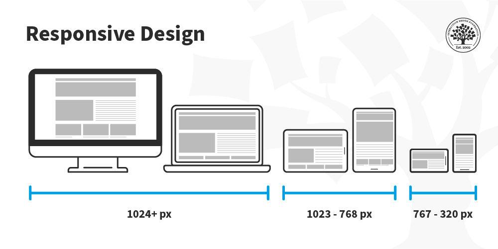
Responsive Design: Making Your Hero Image Shine on Any Device
Creating a stunning hero image that captures attention is pivotal for engaging your website visitors. With responsive design, your hero image can look fabulous on any screen size, from mobile devices to large desktops. Here are some essential tips to ensure your hero image shines wherever it’s viewed:
- Choose the Right Size: Start with a high-resolution image that can scale down without losing quality. Aim for at least 1920px width for desktop and optimize for smaller sizes for mobile devices.
- Use CSS to Define Dimensions: Leverage CSS properties like
width: 100%andheight: autoto ensure the image maintains its aspect ratio as it resizes. - utilize Media Queries: Use media queries in your CSS to serve different images or styles based on the viewport size. This can improve loading times and the overall user experience.
Incorporating a background-image CSS property can also be a powerful approach. Here’s a simple example:
header {
        background-image: url('hero-image.jpg');
        background-size: cover;
        background-position: center;
        height: 100vh; /* Full height */
    }
This setup allows the image to cover the entire header area regardless of the screen size while keeping the focus on the central part of the image.
| Device Type | Recommended Image Size |
|---|---|
| Mobile | 750px |
| Tablet | 1200px |
| Desktop | 1920px |
Lastly, don’t underestimate the power of text overlay. adding compelling copy on top of your hero image can enhance its appeal.Make sure to use contrasting colors to ensure readability,and consider adding a subtle shadow to the text for added depth.
Enhancing Accessibility: Tips for a user-Friendly Hero Image
Creating a hero image that is both visually appealing and accessible is essential for engaging all users. Here are some practical tips to enhance the accessibility of your hero image:
- Use Alt Text Wisely: Every image should include descriptive alt text that conveys the content and purpose of the hero image. This helps screen reader users understand what the image represents.
- Ensure Sufficient Contrast: Make sure there’s a strong contrast between the image and overlay text. This not only aids readability but also supports users with visual impairments.
- Optimize for Different Devices: Responsive design is crucial.Your hero image should resize correctly on various devices to ensure a consistent experience for all users.
- Consider Motion and Animation: If your hero image includes animation or video, provide controls to pause or stop the motion. This is critically important for users who may experience motion sensitivity.
- Limit text Overlays: While it’s tempting to overlay text directly on the image, be cautious. The text should be easy to read and not obscured by complex visuals.
Additionally, you might want to consider using tools and resources that can help you evaluate the accessibility of your hero image:
| Tool | Purpose |
|---|---|
| WAVE | Identify accessibility issues on your webpage. |
| Color Contrast Checker | Ensure your text and background colors meet accessibility standards. |
| Screen Reader Testing | test how users interact with your content using screen readers. |
By implementing these strategies, you not only improve the experience for users with disabilities but also enhance the overall usability of your website. Remember, a user-friendly hero image fosters a welcoming environment that can make a critically important difference in how visitors engage with your content.

Adding Text Overlay: Striking the Right Balance
When it comes to enhancing your hero image, adding a text overlay can significantly impact the viewer’s experience. The key is finding the perfect balance between visibility and aesthetics. You want your message to be clear and engaging without overpowering the stunning visuals of the background.
Here are some essential tips to achieve that balance:
- Contrast is Crucial: Ensure that your text color contrasts well with the background. Light text on a dark background or vice versa can make your words pop.
- opacity Matters: Adjusting the opacity of your text can create a subtle effect that complements the image rather than distracts from it.A slightly transparent white or black overlay can maintain focus on the image while keeping the text legible.
- Font Choice: Select fonts that are both stylish and easy to read.Avoid overly decorative fonts that can confuse the reader.
- Size and Spacing: Use adequate font size and spacing to enhance readability.Ensure that your text isn’t squished, as that can diminish its impact.
To illustrate this, consider creating a simple layout with CSS. you can use the following CSS snippet to style your text overlay effectively:
.hero {
    position: relative;
    background-image: url('your-image-url.jpg');
    height: 400px; /* Adjust as needed */
    background-size: cover;
}

.overlay {
    position: absolute;
    top: 50%;
    left: 50%;
    transform: translate(-50%, -50%);
    color: white; /* Change as needed */
    text-align: center;
    font-size: 2em; /* adjust size */
    opacity: 0.7; /* adjust transparency */
}
lastly, when experimenting with different overlays, consider displaying variations through a table format to compare effectiveness:
| Overlay Type | Effectiveness | notes |
|---|---|---|
| Solid Color | High | Offers strong contrast but may obscure the image. |
| Gradient | Medium | adds depth while maintaining visual interest. |
| Text Shadow | Medium | Enhances readability against busy backgrounds. |

Incorporating Dynamic Elements with CSS Animation
To truly enhance the visual impact of your hero image, incorporating dynamic elements through CSS animations can make a world of difference. These animations not only draw attention but also create a more engaging user experience. By animating certain aspects of your hero image, you can lead your visitors’ eyes to key messages or calls to action.
Here are some animation techniques you can consider implementing:
- Fade-in Effects: This effect can create a smooth transition as the hero image appears, capturing user interest instantly.
- Zoom-In Animation: A subtle zoom effect when the hero image loads can give a sense of depth and immediacy.
- Parallax Scrolling: As users scroll down the page, this technique makes background elements move at a different speed than foreground content, creating a dynamic visual flow.
To implement these animations, you can utilize keyframes in your CSS. Here’s a simple example for a fade-in effect:
@keyframes fadeIn {
    from {
        opacity: 0;
    }
    to {
        opacity: 1;
    }
}

.hero-image {
    animation: fadeIn 2s ease-in-out;
}
Using this simple code, your hero image can smoothly transition into view, enhancing the initial impression for your viewers. Additionally, combining multiple animations can add complexity without overwhelming the user experience. Consider sequencing animations,such as making text appear after the image,to guide users through the content naturally.
for a polished presentation,you might want to create a table to easily manage multiple animations for different elements within your hero section. Here’s an example:
| Element | Animation Type | Duration |
|---|---|---|
| Hero image | Fade-in | 2s |
| Headline Text | Slide-in | 1.5s |
| Call to Action | Zoom-in | 1s |
By utilizing these dynamic elements, you create a hero section that not only looks stunning but also serves a purpose—keeping visitors engaged and encouraging them to explore more of your content. With just a few CSS tweaks, you can transform a static image into an interactive experience that resonates with your audience.
Testing and Tweaking: Ensuring Your Hero Image Looks Great Everywhere
When it comes to hero images,achieving a visually stunning and functional design is essential. Ensuring that your hero image looks great across different devices and screen sizes is a crucial part of the implementation process. Here are a few key considerations to keep in mind:
- Responsive Design: Use CSS media queries to adjust the size and position of your hero image. This ensures it adapts fluidly to various screen resolutions.
- Aspect Ratio: Maintain the correct aspect ratio by setting the width and height to auto. This prevents any stretching or distortion that can detract from your site’s appeal.
- Image Formats: Choose the right format for your hero image. WebP is a great option for quality and loading speed, while JPEG and PNG are also reliable choices depending on the type of image.
Additionally,testing across multiple browsers is vital. Each browser may render images slightly differently, so it’s important to check for consistency. To streamline this process, consider creating a simple testing table:
| Browser | Image Display | Notes |
|---|---|---|
| Chrome | ✔️ | Displays perfectly with no issues. |
| Firefox | ✔️ | same as Chrome, great rendering. |
| Safari | ⚠️ | Check for slight scaling differences. |
| Edge | ✔️ | Looks good, no discrepancies. |
Moreover, consider adding a fallback color or image for older browsers that may not support certain image formats. This ensures your site remains visually appealing, even when certain features aren’t available. Use CSS properties like background-color or background-image to specify these fallbacks.
don’t forget about loading times. Optimize your images by compressing them and using lazy loading techniques to enhance performance. A great-looking hero image should also be fast to load; after all,first impressions matter!
Final Thoughts on Elevating Your Website with a Hero Image
Incorporating a hero image into your website can dramatically enhance its visual appeal and user engagement. The hero image serves as the first impression for visitors, making it crucial to select an image that resonates with your brand’s message and values. By effectively using CSS, you can ensure that your hero image not only looks stunning on various devices but also complements your overall design aesthetic.
When choosing the right hero image, consider the following:
- Relevance: The image should relate to the content and purpose of your site.
- high Quality: Use high-resolution images to avoid pixelation on larger screens.
- Branding: Ensure the image reflects your brand’s identity and tone.
- Emotional Impact: Choose images that evoke a desired emotional response from your audience.
Once you’ve selected the perfect image, it’s time to focus on the CSS styles that will bring it to life. Here are some essential CSS properties to consider:
- Background-size: Use
background-size: cover;to make sure the image covers the entire hero section. - Positioning: Apply
background-position: center;to keep the focal point of the image visible. - Overlay: Consider using a semi-transparent overlay with
rgba(0, 0, 0, 0.5);to enhance text readability.
To illustrate the impact of these elements, here’s a simple table that compares two different hero image implementations:
| Feature | Implementation A | Implementation B |
|---|---|---|
| Image Quality | High Resolution | Low Resolution |
| Overlay | Yes (dark) | No |
| Text Readability | High | Low |
with the right image and effective CSS styles, your hero section can become a powerful tool for storytelling and conversion.An eye-catching hero image not only captures attention but can also guide users toward taking action, whether it’s signing up for a newsletter, exploring products, or learning more about your services. Don’t underestimate the potential of this space; it can truly elevate your website and create a lasting impression on your visitors.
Frequently Asked Questions (FAQ)
Sure! Here’s a conversational Q&A for an article titled “How to Add a Hero Image With CSS”:
Q: What exactly is a hero image?
A: Great question! A hero image is a large, eye-catching image that sits at the top of a webpage. It’s designed to grab your visitors’ attention immediately and frequently enough includes engaging text or a call-to-action. Think of it as the visual anchor for your website!
Q: Why should I consider adding a hero image to my website?
A: Adding a hero image can significantly enhance your website’s aesthetics and user experience. It’s a powerful way to convey your brand’s message, illustrate your offerings, or evoke emotions. Plus, it can help improve your website’s bounce rate since it draws users in!
Q: Is it difficult to add a hero image with CSS?
A: Not at all! With a little bit of CSS knowledge, you can easily style a hero image to make it responsive and visually appealing. Trust me,once you get the hang of it,you’ll wonder why you didn’t do it sooner!
Q: Do I need any special tools or software to add a hero image?
A: Nope! All you need is a basic text editor to write your HTML and CSS. Most websites already have this functionality built-in, so you can jump right in and start designing without any heavy software.
Q: What do I need to include in my HTML to set up a hero image?
A: You’ll start with a simple HTML structure. Generally, you’ll want a div that wraps your image and any text content. Here’s a quick example:

Your Catchy Headline
This sets the foundation for your hero section!
Q: How can I make my hero image responsive?
A: Using CSS,you can ensure your hero image looks great on any device. A common technique is to set the image width to 100% and the height to auto. Here’s a basic CSS snippet:
css
.hero img {
    width: 100%;
    height: auto;
}
This way, your image will scale with the browser size, ensuring it always looks fantastic!
Q: Can I overlay text on my hero image?
A: Absolutely! Adding text overlay is a fantastic way to enhance your image’s impact. You can achieve this with some simple CSS positioning.Here’s how you can do it:
css.hero {
    position: relative;
    text-align: center;
}

.hero h1 {
    position: absolute;
    top: 50%;
    left: 50%;
    transform: translate(-50%, -50%);
    color: white; / Make sure the text stands out! /
}
With this setup, your text will sit perfectly over the image, creating a striking visual effect!
Q: Any final tips for choosing the right hero image?
A: Definitely! Choose an image that resonates with your brand and complement it with clear, bold text. Avoid images that are too busy or cluttered—simplicity is key! And don’t forget to optimize your images for faster loading times. A well-chosen hero image can make all the difference in capturing your audience’s attention!
Q: Where can I find high-quality hero images?
A: There are plenty of resources available! Websites like Unsplash, Pexels, and Pixabay offer stunning, royalty-free images that can elevate your hero section without breaking the bank. Just make sure to choose images that align with your brand’s message!
With this Q&A, you’re well on your way to creating a compelling hero image with CSS that will wow your website visitors! Happy coding!
Concluding Remarks
As we wrap up our journey into the world of hero images with CSS, it’s clear that these captivating visuals are more than just eye candy—they’re powerful tools for communication and engagement. By implementing the techniques we’ve discussed, you can elevate your website’s aesthetic and significantly enhance user experience.
Remember, a well-placed hero image can set the tone for your entire site and draw visitors in, encouraging them to explore further. So why not give it a try? Experiment with different images, styles, and layouts to discover what resonates best with your audience.
If you found this article helpful, don’t hesitate to share it with your fellow web designers or anyone looking to spruce up their site. And of course, if you have any questions or want to share your own hero image success stories, drop a comment below! Let’s keep the conversation going. Happy coding!