Are you looking to elevate your WordPress site with stunning visuals that convey data effortlessly? If so, you’ve landed in the right place! Charts and graphs can transform dull statistics into engaging visuals that captivate your audience and enhance your content. But with so many wordpress chart plugins available, how do you choose the best ones?
In this article, we’ll explore the 11 best WordPress chart plugins that will not only make your data shine but also integrate seamlessly into your site. whether you’re a seasoned blogger, a business owner, or just someone who loves to share insights, these plugins will help you create beautiful, informative charts that resonate with your readers. Plus, we’ll share tips on how to get started with these tools, making data visualization a breeze. Let’s dive in and discover how to transform your data into impressive works of art!
Choosing the Right Chart Plugin for Your WordPress Site
When it comes to enhancing your WordPress site with charts, the plethora of available plugins can be overwhelming. The right chart plugin not only elevates the visual appeal of your content but also serves to communicate your data effectively.Here are some key factors to consider when selecting a chart plugin:
- Ease of Use: Look for plugins that offer intuitive interfaces. Drag-and-drop functionality or straightforward setup processes can save you time and frustration.
- Customization Options: The best plugins allow you to tailor charts to your brand’s aesthetics. Check for options to modify colors, fonts, and chart types.
- Compatibility: Ensure the plugin is compatible with your current theme and other plugins. A responsive design will also ensure your charts look great on mobile devices.
- Support and Updates: Regular updates and robust support are vital for keeping your plugin functioning optimally and secure against vulnerabilities.
performance is another crucial aspect. A plugin that slows down your site can negate the benefits of beautiful charts. Check reviews and test the plugin’s impact on load times before making a decision. A lightweight option can help maintain your site’s speed while providing stunning visualizations.
Additionally, consider the types of charts you need. some plugins specialize in specific chart forms, like pie charts or line graphs, while others offer a versatile range. if you’re planning to present complex datasets, look for plugins that support advanced features like interactive charts or real-time data updates.
| Plugin Name | Key Feature | Price |
|---|---|---|
| WP Charts | User-kind interface | Free |
| Visualizer | Interactive charts and maps | Starts at $49 |
| M Chart | Customizable designs | Free |
| Chart.js | Wide range of chart types | Free |
Ultimately, the ideal chart plugin aligns with your specific needs while enhancing your user experience. By considering these factors, you’re more likely to choose a solution that not only beautifies your site but also engages your audience meaningfully. Don’t hesitate to explore demo versions or trial periods to ensure you find the perfect fit!
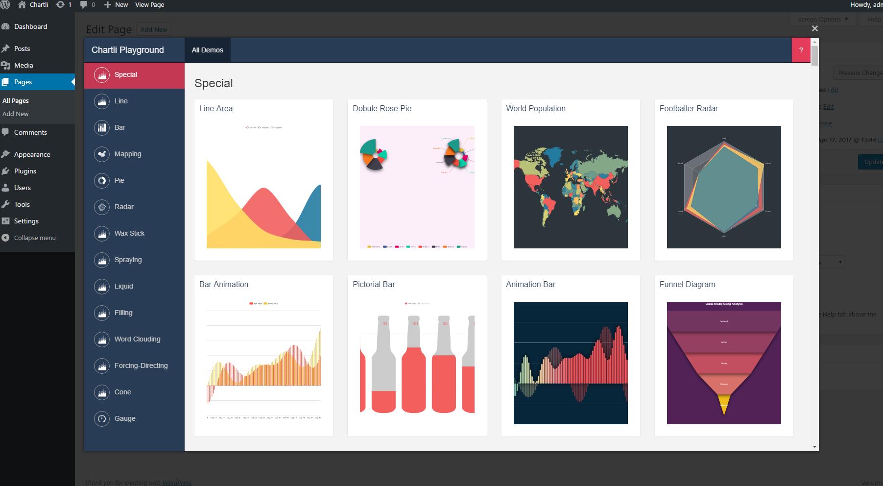
A Closer Look at the Best Free Chart Plugins Available
When it comes to enhancing your WordPress site with captivating visuals, chart plugins are indispensable. They help present complex data in a digestible format,making it easier for your audience to understand and engage with your content.Let’s dive into some of the best free chart plugins available, each offering unique functionalities that cater to different needs.
one of the standout options is Chart.js, a lightweight and flexible JavaScript library that allows for the creation of beautiful charts using the HTML5 canvas element. With its simple configuration, you can create stunning line charts, bar graphs, and more. Another great choice is Visualizer, which enables users to create and manage charts right from the WordPress dashboard with minimal coding knowledge. With support for various chart types, Visualizer makes it easy to transform your data into eye-catching visuals.
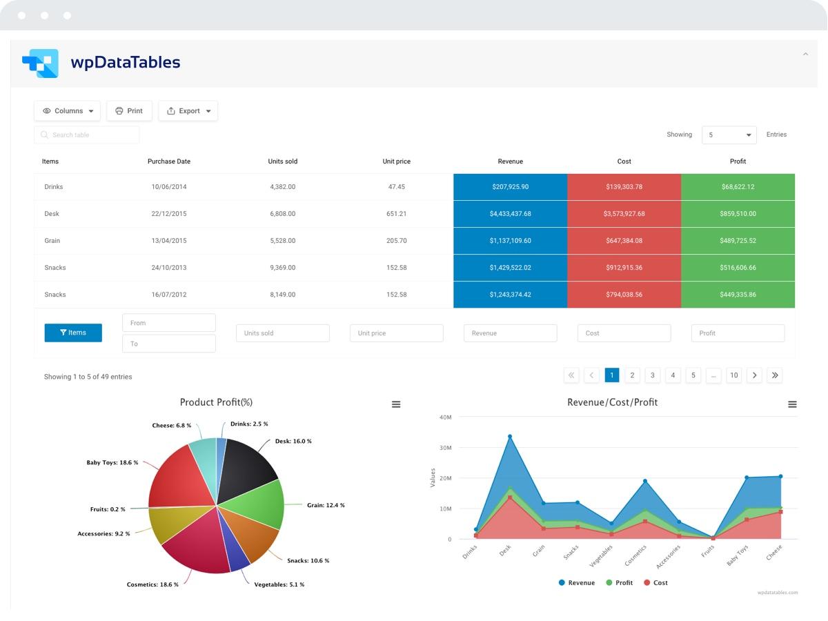
If you’re looking for a plugin that integrates well with Google sheets, consider WP DataTables. This powerful tool allows you to pull data directly from your spreadsheets and create dynamic tables and charts effortlessly. The flexibility of this plugin ensures that even non-technical users can generate responsive tables and charts without breaking a sweat.
For those who want to customize their charts further, Charts and Graphs is an excellent choice.This plugin offers a user-friendly interface to create customizable charts with various design options. You can select from different chart types, including pie, bar, and area charts, and tweak colors and layouts to match your website’s aesthetic. Below is a simple comparison of some of these plugins:
| Plugin Name | Key Features | User-Friendly? |
|---|---|---|
| Chart.js | Lightweight, flexible, supports multiple chart types | Yes |
| Visualizer | Easy management, various chart types, no coding needed | Yes |
| WP DataTables | Google Sheets integration, dynamic charts | Moderate |
| Charts and Graphs | Customizable designs, multiple chart options | Yes |
don’t overlook M Chart, a plugin designed for those who thrive on simplicity. M Chart allows users to create basic charts without any intricate settings or configurations. This makes it ideal for bloggers and small businesses looking to present data straightforwardly. With these options at your fingertips, creating beautiful charts for your WordPress site has never been easier. Each plugin brings its own strengths, so consider what best fits your specific needs and start turning your data into stunning visuals.
Step-by-Step Guide to Installing and Setting Up Your Chart Plugin
Installing Your Chart Plugin
Getting started with your chosen chart plugin is a straightforward process. Follow these simple steps to ensure a smooth installation:
- Log in to your WordPress Dashboard: Begin by entering your WordPress admin area.
- Navigate to Plugins: On the left sidebar, click on Plugins, then select Add New.
- Search for the Plugin: Use the search bar to find the chart plugin you want to install. Such as, you could search for “ChartJS”, “Visualizer”, or any other name from your list of top chart plugins.
- Install and activate: Once you’ve found the plugin, click Install Now, and after it installs, click Activate to start using it.
Setting Up Your Chart Plugin
After activation, you’ll need to configure the plugin settings to get the most out of its features. here’s how:
- Access the Plugin Settings: Locate the newly added menu item in your dashboard,typically under Settings or its own dedicated section.
- Configure Basic Settings: adjust general settings, such as chart types, colors, and data sources. Make sure to familiarize yourself with all options available.
- Import Data: Depending on the plugin, you can import data via CSV files, connect to google Sheets, or input data manually. Make sure your data is clean and formatted correctly to ensure accurate charts.
Creating Your First Chart
Now that your plugin is installed and configured, it’s time to create your first chart. Follow these steps:
- Select Chart Type: Choose the type of chart that best represents your data—bar charts, line charts, pie charts, etc.
- Input Data: Fill in your data according to the plugin’s requirements. Some plugins may offer templates to make this easier.
- Customize Appearance: Personalize your chart with titles, labels, and colors. This is where you can truly let your creativity shine!
- Preview and Publish: always preview your chart before publishing to check for any adjustments needed. Once satisfied, add the chart to your desired page or post.
Tips for Effective Chart Creation
to make the most of your charts,keep these tips in mind:
- Keep It Simple: Overly complex charts can confuse viewers. Aim for clarity and straightforwardness.
- Use colors Wisely: Colors can enhance readability but should be used judiciously to avoid overwhelming the audience.
- Provide Context: Always include titles and descriptions to give viewers insight into what the chart represents.
Quick Reference Table of Chart Plugins
| Plugin Name | Key Features | Best For |
|---|---|---|
| Visualizer | Interactive charts, Google Sheets integration | Data visualization |
| ChartJS | Customizable charts, various types | Developers |
| WP DataTables | Responsive tables and charts | Data management |
| WP Charts | Fast setup, user-friendly | Beginners |
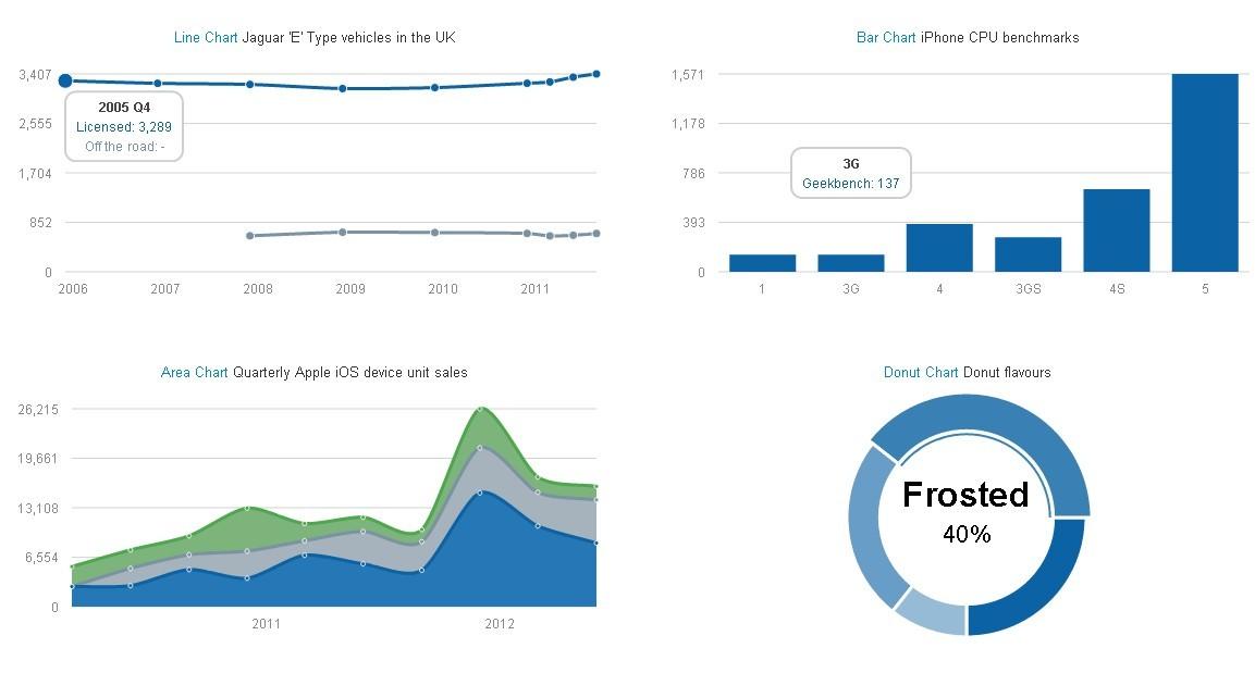
Creating Stunning Charts Using Your Chosen Plugin
When it comes to creating visually compelling charts, the right plugin can make all the difference. Each plugin in our curated list offers unique features and customization options, allowing you to tailor your charts to fit your site’s aesthetics and branding beautifully. Whether you prefer bar graphs, pie charts, or line charts, these tools can help you present data in an engaging and digestible manner.
To get started,follow these simple steps to create stunning charts:
- Install and activate your chosen plugin from the wordpress plugin repository.
- familiarize yourself with the interface. Most plugins offer intuitive dashboards that make navigation easy.
- Import your data directly or input it manually, depending on the functionality of the plugin.
- Customize your chart by choosing colors, fonts, and styles that align with your site’s branding.
- Preview and adjust your chart to ensure it looks just right before publishing it to your site.
- Insert the chart into your posts or pages using shortcodes or block editor integration.
Many of these plugins also include responsive design capabilities, ensuring your charts look great on any device. This is especially crucial in today’s mobile-first world, where users expect seamless experiences. additionally,some plugins allow for real-time data updates,which can be a game-changer for sites that rely on statistics that change frequently,such as financial reports or live sports scores.
| Plugin Name | Chart Types | Responsive |
|---|---|---|
| Visualizer | Line, Bar, Pie | ✔️ |
| WP Charts | Bar, Area, Scatter | ✔️ |
| Data Tables Generator | Pie, Column | ✔️ |
Don’t forget to take advantage of interactive features offered by many plugins. These can include hover effects, tooltips, or clickable elements that provide additional context to your data. Such features not only enhance user engagement but also improve your site’s overall professionalism and reliability in presenting data.
Integrating Charts with your Content for Maximum Impact
Incorporating charts into your content can significantly enhance its appeal and effectiveness. Visual data representation can simplify complex information, making it easier for your audience to grasp key insights at a glance. By strategically embedding charts within your articles, you can not only break up lengthy blocks of text but also guide your readers’ attention towards crucial statistics that bolster your arguments.
Here are some tips to maximize the impact of your charts:
- Choose the Right Type of Chart: Different data requires different types of charts. As an example, bar charts are great for comparing quantities, while line charts can effectively illustrate trends over time.
- Ensure Clarity: Avoid cluttering your charts with excessive information. Keep them simple, using clear labels and a minimal color palette to highlight the most critically important data points.
- Use Responsive Design: many users access content on mobile devices. Ensure that your charts are responsive so that they maintain readability and aesthetic appeal across all screen sizes.
Implementing engaging charts can be made even easier with the right plugins. There are numerous WordPress chart plugins available that allow you to create stunning visuals without needing advanced technical skills. Whether you’re sharing sales data,survey results,or statistical analysis,these tools can help you generate professional-looking charts quickly.
For instance, here’s a simple comparison table featuring a few popular WordPress chart plugins:
| Plugin Name | Key Features | Price |
|---|---|---|
| Visualizer | Easy interface, Google Sheets integration | free/Premium |
| wpDataTables | Responsive tables, real-time data | Premium |
| Chartify | Customizable charts, drag & drop builder | Free |
Lastly, consider the placement of your charts within the content. They should complement your narrative, appearing at points where they can reinforce your message. Such as, placing a chart immediately after introducing a key statistic allows readers to visualize the data you just mentioned, creating a more cohesive reading experience. With thoughtful integration of visual elements, your content can not only inform but also captivate your audience.
Tips for Analyzing and Presenting Data Effectively
Whether you’re presenting data to stakeholders or crafting a report for your blog,the way you analyze and present your information can make all the difference. To ensure your audience fully grasps the insights you’re sharing,consider the following tips:
- Know Your Audience: Tailor your data presentation style to your audience’s level of expertise. Technical jargon may confuse non-experts, while an oversimplified approach might bore industry professionals.
- Choose the Right Visualization: Different types of data require different visualization methods. For example, use bar charts for comparisons, line graphs for trends over time, and pie charts for showing proportions.
- Highlight key Insights: Don’t let your audience get lost in the details. Use callouts or annotations on your charts to point out significant findings and trends that you want to emphasize.
Incorporating interactivity can also enhance the user experience. Many WordPress chart plugins allow for interactive elements such as tooltips and clickable legends. This feature not only engages viewers but also enables them to explore the data at their own pace.
Additionally,consider the overall design of your charts. A clean,uncluttered layout with consistent colors and fonts can make your data more digestible. here’s a simple guide for effective chart design:
| Design Element | best Practices |
|---|---|
| Color Scheme | Use a limited palette that aligns with your brand. |
| Font Choice | Select clear, legible fonts for labels and titles. |
| Labeling | Ensure all axes and data points are well-labeled for clarity. |
lastly, practise data storytelling. Connect your data to a narrative that resonates with your audience. This technique not only captures attention but also helps to reinforce the importance of your findings. By weaving in anecdotes or relevant examples, you can make your data relatable and memorable.
Troubleshooting Common issues with WordPress Chart Plugins
When using chart plugins in WordPress, you may encounter some common issues that can disrupt your data visualization efforts. Here are a few troubleshooting tips to help you resolve these problems quickly and effectively.
Plugin Conflicts: One of the most frequent issues arises from conflicts between different plugins. To identify this, temporarily disable all plugins except the chart plugin and see if the problem persists. If it resolves, reactivate each plugin one by one to pinpoint the conflict.If you find the culprit, you may need to consider alternatives:
- Check for updates for both plugins.
- Contact the plugin developers for support.
- Look for a different chart plugin that meets your needs.
JavaScript Errors: Many chart plugins rely on JavaScript for dynamic functionality. If your charts are not displaying or are malfunctioning, open your browser’s console (usually accessible via F12) to check for JavaScript errors. Common solutions include:
- Clearing your browser cache.
- Ensuring your theme is compatible with the plugin.
- Disabling minification or optimization plugins that might be affecting your scripts.
Data Formatting Issues: Incorrectly formatted data can lead to distorted charts. Ensure that your data is correctly structured according to the plugin’s requirements. Check for:
- Consistent data types (e.g., numbers vs. strings).
- Proper array structures if importing data from external sources.
- Correct usage of delimiters in CSV files.
If you’re still facing challenges, consider utilizing a troubleshooting table that outlines the common problems, their potential causes, and suggested solutions:
| Issue | Possible Cause | Solution |
|---|---|---|
| Chart not displaying | Plugin conflict | Disable conflicting plugins one by one |
| JavaScript errors | Incorrect theme compatibility | Switch to a default theme |
| Data not updating | Caching issues | Clear cache and refresh |
By following these steps and suggestions, you can effectively address common issues with your WordPress chart plugins, ensuring smooth and beautiful data presentations on your site.
Frequently Asked Questions (FAQ)
Q&A for “11 Best WordPress Chart Plugins + How to create Beautiful Charts”
Q: Why should I use chart plugins on my WordPress site?
A: Great question! chart plugins are a fantastic way to visualize your data,making it easier for your audience to understand complex information at a glance. Whether you’re presenting sales statistics,survey results,or any other data-driven content,charts can enhance your posts,making them more engaging and informative. Plus, they can help your site stand out in a sea of text!
Q: What are some of the best chart plugins available for WordPress?
A: You’re in luck! We’ve compiled a list of the 11 best WordPress chart plugins that cater to different needs. Some of the top contenders include WP Charts, Visualizer, and Chart.js. Each of these plugins offers unique features, like customizable designs and various chart types, ensuring you can find the perfect fit for your site.
Q: Can I create beautiful charts without any coding knowledge?
A: Absolutely! Most of the plugins we recommend have user-friendly interfaces that allow you to create stunning charts with just a few clicks. You don’t need to be a tech whiz or a designer to produce professional-looking visuals. the drag-and-drop functionality and pre-built templates make it super easy to get started!
Q: How do I choose the right chart plugin for my needs?
A: Consider what type of data you’ll be displaying and how you want your charts to look. Some plugins are better for simple bar graphs, while others excel at interactive pie charts or line graphs. Also, think about your audience—do you need something that is visually striking, or is straightforward functionality more important? our article dives into the specifics of each plugin, helping you make an informed decision!
Q: Can I integrate these charts with other tools I’m already using?
A: Yes! Many of the top WordPress chart plugins offer integrations with popular tools like Google Sheets and Excel. This means you can easily pull in your data and keep your charts updated without manual entry. It’s all about streamlining your workflow, making it easier to present accurate information to your visitors.
Q: Will using charts improve my website’s SEO?
A: While charts themselves may not directly impact SEO, they can enhance your content’s appeal, leading to longer visit durations and lower bounce rates. Engaging visuals can also encourage social sharing, which can indirectly boost your SEO efforts. Plus, well-structured data can improve accessibility, making your site more user-friendly for everyone.Q: what are some best practices for creating effective charts?
A: Focus on clarity and simplicity. avoid cluttered designs and make sure your charts tell a clear story. Use contrasting colors to distinguish between data points, and always label your axes and legends. Our article provides tips on design and data presentation to ensure your charts are not just beautiful, but also functional and informative.
Q: How can I ensure my charts look good on mobile devices?
A: Most modern chart plugins are responsive, meaning they will automatically adjust to different screen sizes. However, it’s always a good idea to preview your charts on various devices. Check if your chosen plugin provides customization options for mobile views, ensuring that no matter how your audience accesses your site, they’ll have a great experience.
Q: Where can I find more information about these plugins and how to use them?
A: Our article is a complete guide! We explore each plugin in detail, including features, pros and cons, and step-by-step instructions on how to set them up.You’ll also find links to tutorials and support resources to help you every step of the way. So dive in and get ready to elevate your data presentation game!
Q: Is there a cost associated with these plugins?
A: Many plugins offer free versions with basic features, which is perfect for those just starting out. However, some advanced functionalities may require a premium purchase. Our article highlights both free and paid options, so you can choose what fits your budget and needs best.
Remember,the right plugin can transform the way you communicate information on your website. So, let’s get started and make those charts shine!
The Way Forward
And there you have it—the ultimate guide to the 11 best WordPress chart plugins that can elevate your data presentation to a whole new level! Whether you’re a blogger looking to enhance your content, a business owner wanting to share insights with your audience, or a marketer aiming to make your data more digestible, these plugins are sure to meet your needs.Remember, the right chart can make complex information not only understandable but also engaging.So, take your time exploring these options, try out a few, and see which one resonates with your style and audience. the best part? Most of these plugins are user-friendly and offer a range of customization options, allowing you to create stunning visuals that truly reflect your brand.
Now, don’t just sit there; go ahead and give your data the upgrade it deserves! Dive into the world of beautiful charts and watch how they transform your website.If you have any questions or need further assistance, feel free to drop a comment below. Happy charting!