Introduction
Are you ready to take your WordPress site to the next level? If you’ve ever felt overwhelmed by a cluttered navigation bar or struggled to find a way to showcase all your importent pages, you’re in the right place! A well-designed mega menu can transform your website’s user experience, making it not only more visually appealing but also incredibly functional.Imagine having all your key links neatly organized in one drop-down menu,allowing visitors to find what they need with just a few clicks. Sounds great,right?
In this beginner’s guide,we’ll walk you through the simple steps to create a stunning mega menu in wordpress,even if you’re just starting out. Don’t worry if you’re not a coding whiz or a design expert—this guide is tailored for everyone! So grab a cup of coffee, and let’s dive into the world of mega menus and unlock the full potential of your website!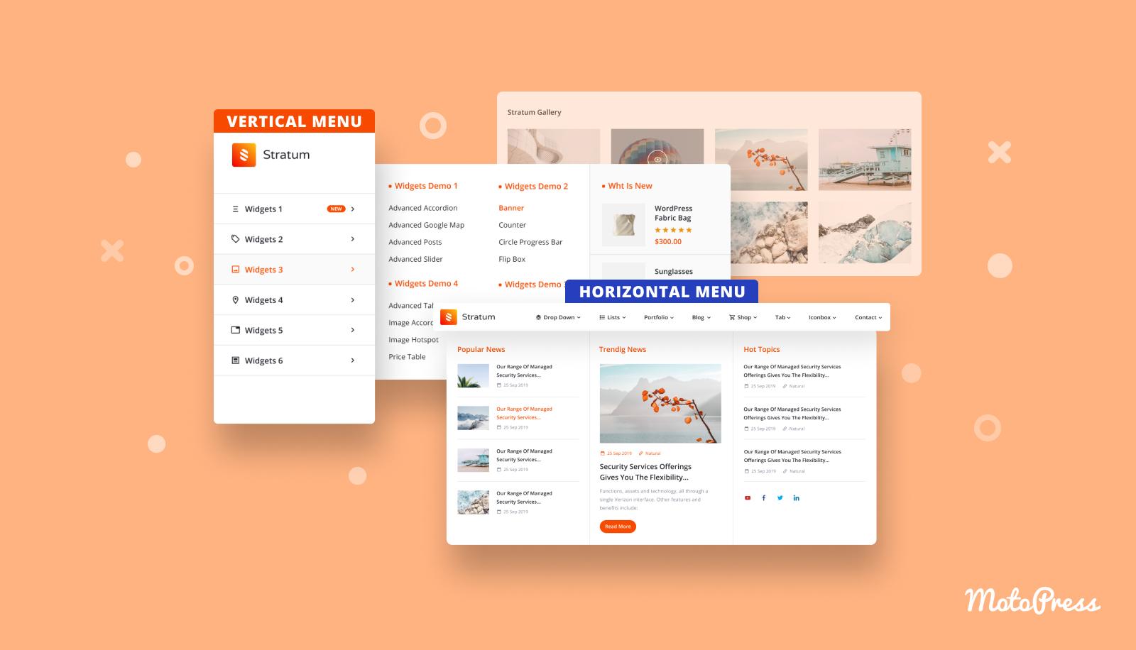
understanding the Basics of Mega Menus and Their Benefits
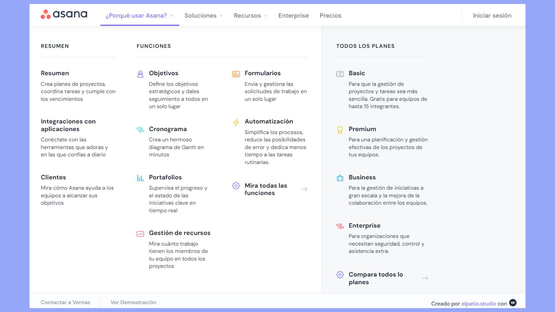
Mega menus are a powerful navigational tool that can considerably enhance user experience on your WordPress site. Unlike customary dropdown menus, mega menus allow you to display multiple levels of links and content in a well-organized manner. This not only helps visitors easily find what they are looking for but also allows you to showcase important data and categories at a glance.
One of the primary benefits of implementing a mega menu is improved accessibility.By presenting more options in a visually appealing format, users can quickly navigate to their desired section without having to dig through multiple layers of sub-menus. This streamlined approach can lead to increased engagement and lower bounce rates, as visitors are more likely to explore your site when they can easily find relevant content.
Another advantage is the prospect for better categorization. Mega menus enable you to group related pages together,making it easier for users to understand the structure of your site. As an example, if you run an e-commerce store, you could categorize products by type, brand, or even seasonal collections. This organization not only aids in navigation but can also enhance your site’s search engine optimization (SEO) by creating clear pathways for crawlers to follow.
Additionally, mega menus can be designed to be visually stunning and on-brand. You can incorporate images, icons, and even brief descriptions to grab attention and entice users to click through. Here are some elements you might include in your mega menu:
- Sub-categories: Clearly defined sections for easier navigation.
- Featured Products: Highlight top-selling or new items.
- Promotional Banners: Incorporate sales or special offers.
Lastly, creating a mega menu is not as daunting as it may seem. WordPress offers various plugins and themes that simplify the process, allowing even beginners to set up a professional-looking menu with ease. With just a few clicks, you can transform your navigation and elevate the overall usability of your website.
Choosing the Right WordPress Theme for Your Mega Menu
When it comes to creating a mega menu in WordPress, choosing the right theme is crucial. A well-designed theme not only enhances your website’s aesthetics but also affects the functionality of your mega menu. Here are some essential factors to consider:
- Responsive Design: Ensure that the theme you choose is mobile-friendly. A responsive design will help your mega menu display correctly on various devices, providing an optimal user experience.
- Customization Options: Look for themes that offer extensive customization features. This allows you to tailor the mega menu to fit your brand’s identity, whether it’s through colors, fonts, or layout.
- Compatibility with Plugins: Make sure the theme is compatible with popular mega menu plugins like Max Mega Menu or WP Mega Menu.This compatibility will provide additional functionality and ease of use.
- SEO Optimization: Choose a theme that follows best SEO practices. A well-structured mega menu can improve site navigation and boost your search engine rankings.
Additionally, here’s a speedy comparison of some popular themes that work exceptionally well with mega menus:
| Theme Name | Responsive | Customization | SEO Friendly |
|---|---|---|---|
| Astra | ✅ | High | ✅ |
| Divi | ✅ | very High | ✅ |
| OceanWP | ✅ | Medium | ✅ |
| GeneratePress | ✅ | medium | ✅ |
don’t forget to check user reviews and ratings. These insights can provide valuable information about the theme’s performance and support. By carefully considering these aspects, you can select a WordPress theme that will make your mega menu not only functional but also a stunning visual element of your website.
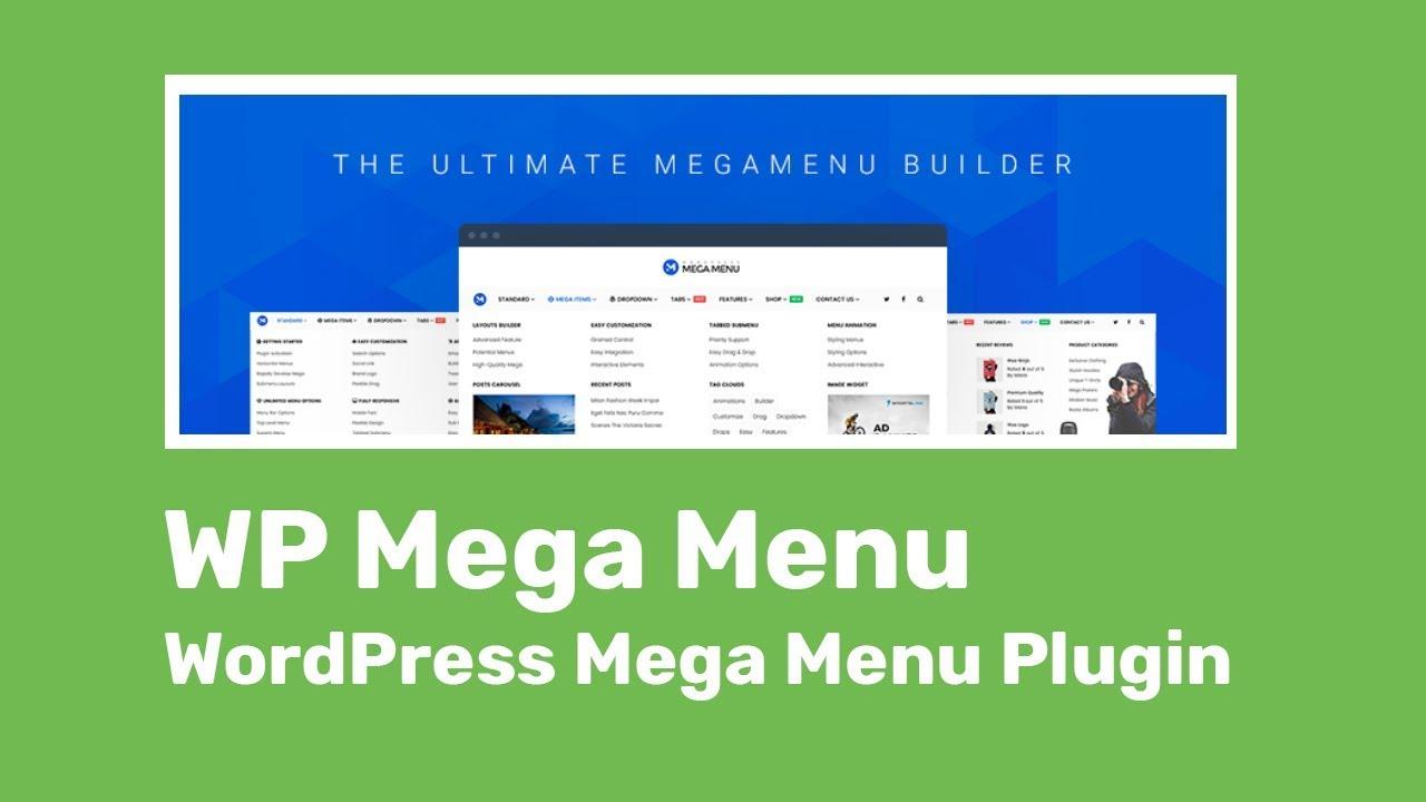
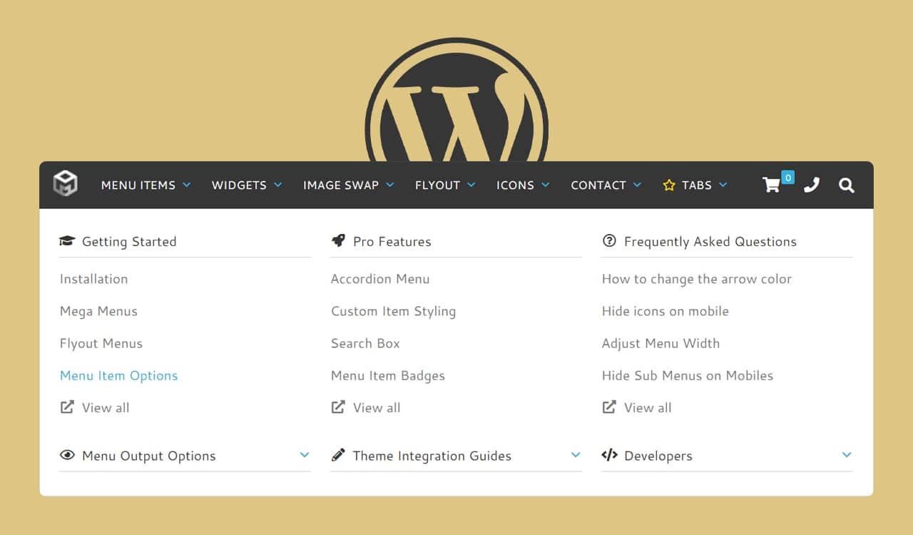
Step-by-Step Guide to Installing a Mega Menu Plugin
Setting up a mega menu plugin on your wordpress site can seem daunting, but with the right steps, you can have a stunning navigation feature that’s both functional and visually appealing. Here’s how to do it:
First, you need to choose a mega menu plugin that fits your needs. Some popular options include:
- Max Mega Menu
- WP Mega Menu
- ubermenu
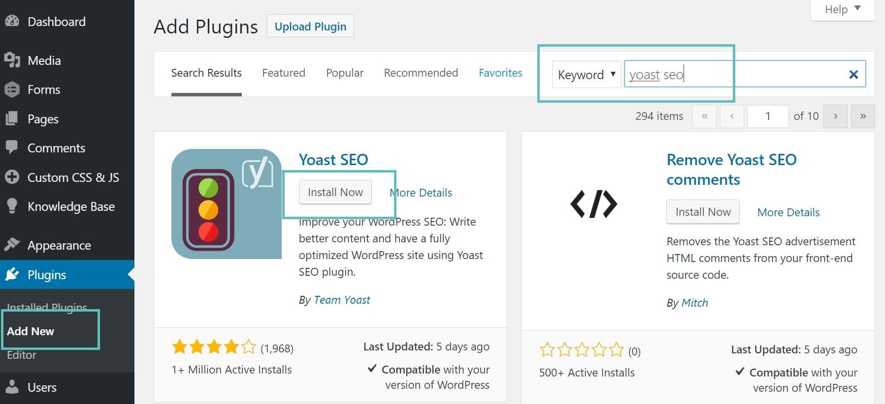
Once you’ve settled on a plugin, head over to your WordPress dashboard.
Navigate to Plugins > Add New. in the search bar, type the name of the plugin you chose and hit Enter. When you find the plugin in the results, click on the Install Now button.
after the installation is complete, click Activate. This will enable the plugin and make its settings available for customization.
Next,you’ll wont to configure the mega menu settings. Go to the plugin’s settings page,typically found under the Appearance menu. Here, you can:
- Choose the layout and style of your mega menu
- Add icons or images to menu items
- Set up dropdowns and columns for better organization
Make sure to save your changes. test your new mega menu by navigating through your site to ensure everything is functioning as expected. A well-organized mega menu can enhance user experience and help visitors find what they need easily!
Design Tips for an Attractive and User-Friendly Mega Menu
Creating an attractive and user-friendly mega menu is crucial for enhancing the navigational experience on your WordPress site. Here are some essential design tips that will make your mega menu not just functional but also visually appealing.
- Keep It Simple: A cluttered menu can overwhelm users. Aim to present your content in a clean and organized manner. Use clear headings and logical grouping to guide users through your offerings.
- Use Visual Hierarchy: Make important items stand out by using larger fonts or bold styles. Sub-menus should be visually distinct but still part of the overall design theme.
- Incorporate Icons: Adding icons next to menu items can help users quickly identify what each category entails. This visual guide not only enhances aesthetics but also improves usability.
Incorporating color effectively is another crucial aspect. Choose a color palette that aligns with your branding while ensuring sufficient contrast for readability. Here’s a quick reference table for color choices:
| Color | Use Case |
|---|---|
| Blue | Trust & Reliability |
| Green | Growth & Harmony |
| Red | Excitement & Urgency |
- Mobile Responsiveness: Ensure that your mega menu is optimized for mobile devices.A touch-friendly design is essential as many users navigate via smartphones and tablets.
- Test Navigation Flow: Before finalizing your design, conduct usability tests.Gather feedback from users to identify any navigational pain points that may need addressing.
Lastly, don’t forget about accessibility. Ensure that your mega menu is compatible with screen readers and that color choices are friendly for color-blind users. Making your site inclusive is not only ethical but also expands your audience reach.
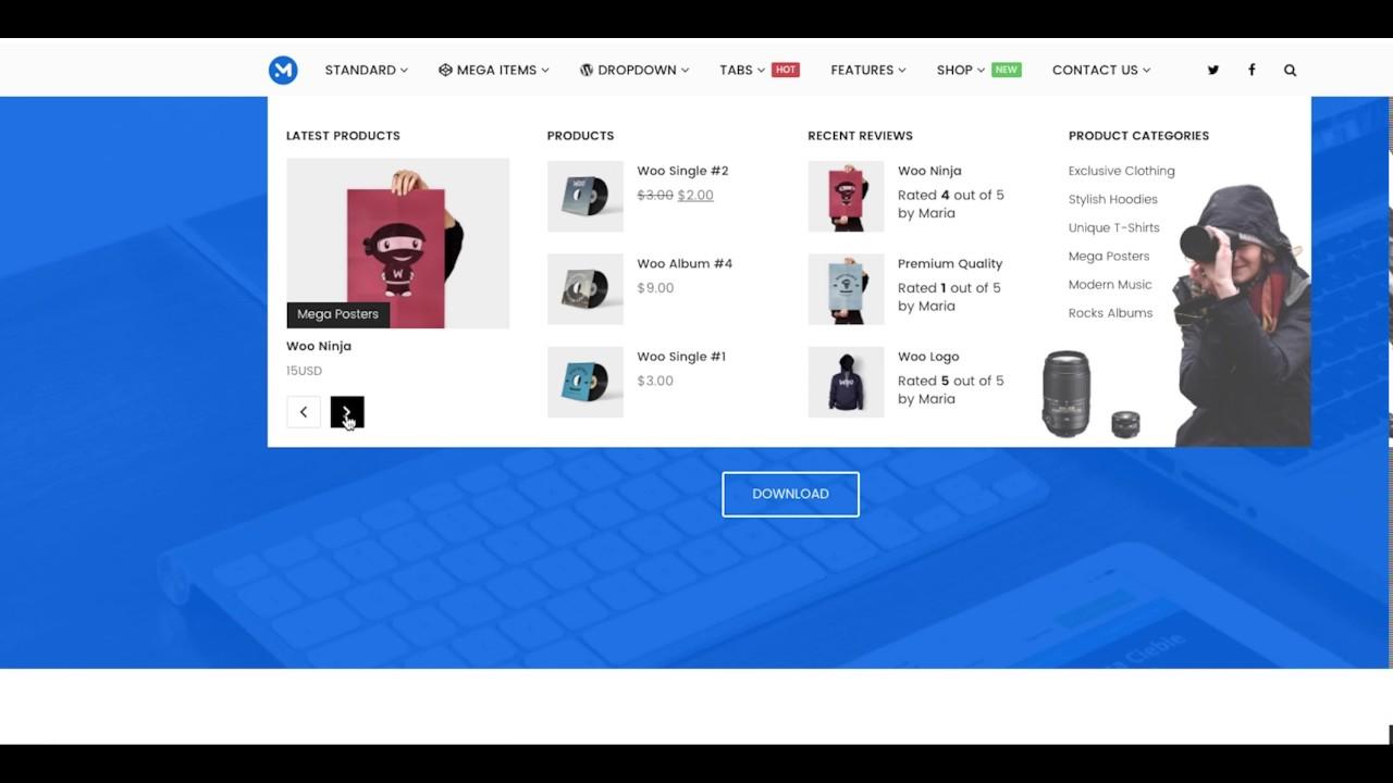
How to Organize Your Menu Items for Maximum Impact
Creating a mega menu can significantly enhance the user experience on your wordpress site, allowing visitors to navigate effortlessly through your offerings. To achieve maximum impact, it’s essential to organize your menu items in a way that makes sense and engages your users. Here are some key strategies:
- Group Related Items: Start by categorizing menu items into logical groups. For example, if you run an e-commerce site, categorize products by type, such as Clothing, Accessories, and Shoes. This organization helps users find what they need quickly and easily.
- Utilize Submenus: Take advantage of submenus for deeper navigation. A well-structured mega menu allows you to include multiple layers of items. For instance, under ”Clothing,” you might have subcategories like “Men,” “Women,” and “Kids.”
- Prioritize Popular Items: Place your most popular or high-impact items at the top of each category. This will guide users to the items you want to promote, increasing the chances of conversion.
Along with organization, consider incorporating visual elements into your mega menu. Using images or icons can make it more engaging and help users quickly identify categories. Here’s a simple layout to visualize:
| Category | Items | Visual Aid |
|---|---|---|
| Clothing | Men, Women, kids |  |
| Accessories | Bags, Jewelry, hats |  |
| Shoes | Casual, Formal, Sports |  |
Lastly,ensure your mega menu is mobile-friendly. With a growing number of users browsing on smartphones, it’s vital that your menu translates well across all devices.Test your mega menu on various screen sizes to guarantee that all items are accessible without clutter.
by thoughtfully organizing your menu items, you not only enhance usability but also elevate the overall aesthetic of your WordPress site. A well-structured mega menu invites exploration, ultimately leading to increased engagement and higher conversion rates!
Customizing your Mega Menu’s Style and Appearance
Customizing the style and appearance of your mega menu can significantly enhance user experience and elevate your website’s aesthetics. With a few tweaks, you can transform a standard dropdown into a visually appealing navigation hub that attracts visitors’ attention. Start by considering the color scheme of your website. Ensure your mega menu complements your site’s branding while providing enough contrast to be easily readable. use the following guidelines to help you style your menu:
- Consistent Colors: Keep the color palette consistent with your brand identity.
- Readable Fonts: Choose clear, legible fonts that match your website’s overall font style.
- Hover Effects: Implement hover effects to signal interactivity, like changing colors or adding underlines.
Next, focus on layout and spacing. A well-structured mega menu not only looks good but also improves usability.You can organize your menu into columns to categorize different content types. Here’s a simple layout example:
| Category | subcategories |
|---|---|
| Products | Electronics, Fashion, Home Goods |
| Services | Consulting, Support, Development |
| Resources | Blog, Tutorials, Webinars |
Moreover, don’t underestimate the power of images and icons. Incorporating visuals can make your mega menu more engaging.Use appropriate icons next to each category or submenu to provide a visual cue that aids navigation. Just ensure that the images are optimized for fast loading times to avoid any detriment to user experience.
always test your mega menu across different devices. Responsiveness is key in today’s mobile-centric world. Ensure that the layout adjusts seamlessly whether viewed on a desktop, tablet, or smartphone. Utilize media queries in your CSS to achieve this, and conduct thorough testing to catch any discrepancies.
Testing Your Mega Menu for Responsiveness and Usability
Once your mega menu is set up, it’s crucial to ensure it performs well across various devices and screen sizes. A responsive mega menu enhances user experience and keeps visitors engaged.Start by testing how your menu appears on desktops, tablets, and smartphones. Pay attention to both layout and accessibility.
One of the key elements to observe is how the menu items stack or rearrange themselves on smaller screens. You can use tools like Google Developer Tools to simulate different devices. here are some tips to keep in mind during your testing:
- Check for easy navigation—ensure that all links are clickable and clearly visible.
- Look for any overlapping text or images that may confuse users.
- Ensure that dropdown menus function smoothly without lag or delay.
- Test the overall loading speed of your mega menu; a slow menu can frustrate users.
Don’t forget about usability. Even if your mega menu looks great on various devices, it must also be intuitive. Create a quick feedback loop with real users to gain insights on their experience. You might consider a simple survey or feedback form. Here’s a sample table to track user feedback effectively:
| User | Device | Feedback |
|---|---|---|
| John Doe | Smartphone | Easy to navigate, but items were to small. |
| Jane Smith | Tablet | Great layout,but some links were hard to find. |
| Tom Brown | Desktop | Perfectly organized,loved the hover effects! |
Ultimately,the goal is to create a mega menu that is not only aesthetically pleasing but also user-friendly. Taking the time to test and refine your mega menu based on real user feedback can make a significant difference in how potential customers interact with your site.Always remember to iterate based on findings and continue to seek ways to improve usability.
Common Mistakes to Avoid When Creating a Mega Menu
when designing a mega menu, it’s easy to get caught up in the aesthetics and functionality, but there are common pitfalls to watch out for. One frequent mistake is overcrowding the menu with too many items. A cluttered menu can overwhelm users, making it tough for them to find what they’re looking for.Rather, aim for a streamlined approach by categorizing items effectively and prioritizing the most critically important links.
Another common error is neglecting mobile optimization. Many users access websites from their mobile devices, and a mega menu that looks great on desktop may not translate well on smaller screens. Ensure your mega menu is responsive and easy to navigate on all devices.this might involve creating a simpler version of the menu for mobile users, or utilizing collapsible sections to save space.
consistency is key in web design, and your mega menu should align with the overall branding of your site. Avoid using mismatched colors or fonts, as this can create a disjointed experience for users.Stick to your established style guide to maintain a cohesive look and feel across your website. Remember, the mega menu is frequently enough the first interaction users have with your site; make it count!
It’s also essential to consider accessibility during the design process. Many users rely on screen readers or keyboard navigation, and failing to account for these can alienate a significant portion of your audience. Use proper HTML markup and ensure that all menu items are easily navigable with keyboard shortcuts. Incorporating ARIA roles can enhance accessibility for users with disabilities.
lastly, don’t forget to regularly review and update your mega menu. As your content and audience evolve, so should your navigation.Periodically assess your analytics to identify which links are underperforming or if users are dropping off at specific points in the menu. This information can guide you in making necessary adjustments to improve user experience.
Enhancing Your Mega Menu with Icons and Visual Elements
can significantly improve user experience and navigation. By incorporating these features, you not only make your menu more visually appealing but also help users quickly identify categories and subcategories. Here are some techniques to elevate your mega menu:
- Use Icons: Integrate relevant icons next to menu items. for instance, a shopping cart for e-commerce links or a camera for photography services. this visual cue makes it easier for users to recognize their desired sections at a glance.
- color Coding: differentiate sections using distinct colors. This not only beautifies your menu but also organizes it, making navigation feel more intuitive.
- Images and Thumbnails: Including small images or thumbnails can enhance your mega menu’s appeal. For example, showcasing products or featured articles can entice users to click through.
When it comes to styling, ensure that your icons and images are optimized for the web. this means reducing file sizes without sacrificing quality, ensuring faster loading times. Additionally, CSS styles can be applied to adjust the size and padding of images/icons for a cohesive look.Here’s a simple example of how to style icons in your mega menu:
.menu-item-icon {
    width: 20px;
    height: 20px;
    margin-right: 8px;
    vertical-align: middle;
}
Consider the following table as a guide for selecting icons based on your menu categories:
| Menu Category | Suggested Icon |
|---|---|
| Home | 🏠 |
| Shop | 🛒 |
| Blog | 📝 |
| Contact | 📞 |
always test the usability of your mega menu with icons and visual elements. Gather feedback from users to determine if the design enhances their experience. By continually refining your approach, you can create a mega menu that not only looks great but also drives engagement and conversions.
Maintaining and Updating Your Mega Menu for Future Needs
To ensure your mega menu continues to serve your audience effectively,regular maintenance and updates are essential. An evolving website often reflects changes in your business,the introduction of new products or services,or shifts in user behavior. Keeping your mega menu aligned with these changes can enhance user experience and improve site navigation.
Start by periodically reviewing the items listed in your mega menu. Consider the following:
- User Engagement: Analyze which sections are frequently accessed. Use analytics tools to track user behavior and adjust your menu accordingly.
- Content Updates: As you add new content, ensure it’s represented in your mega menu. This keeps your site fresh and encourages visitors to explore.
- Feedback Integration: Listen to user feedback. If certain items are consistently noted as difficult to find, it may be time to rethink their placement.
Another vital aspect is the aesthetic and functional design of your mega menu. As web design trends evolve, so should your menu. Updating the visuals can keep your site modern and engaging.Consider implementing:
- Responsive Design: Ensure your mega menu looks great on all devices, especially mobile.
- Dynamic Elements: Use hover effects or animations to draw attention to specific items.
- Clear Hierarchy: Make sure categories and subcategories are logically arranged for effortless navigation.
schedule periodic reviews of your mega menu, at least once every few months. This will help you stay ahead of potential issues and keep your content relevant. Here’s a simple schedule you could follow:
| review Frequency | Action Items |
|---|---|
| Monthly | Check analytics, adjust based on user behavior. |
| Quarterly | Update visual design, refresh outdated content. |
| Bi-Annually | Conduct user feedback sessions, assess overall effectiveness. |
By keeping your mega menu up-to-date and user-focused, you’ll not only enhance the user experience but also improve overall site performance and engagement. The effort you invest in refining this element will pay off in the long run, leading to increased customer satisfaction and loyalty.
Frequently Asked Questions (FAQ)
Q&A: How to Create a Mega Menu in WordPress? Beginner’s Guide
Q1: What is a mega menu,and why should I consider using one for my WordPress site?
A1: Great question! A mega menu is a larger,more elaborate drop-down menu that displays multiple levels of navigation at once. Think of it as a way to organize and showcase your content more effectively.By utilizing a mega menu,you can enhance user experience,make your site more visually appealing,and help visitors find what they’re looking for faster. if you want your site to stand out and be user-friendly, a mega menu is definitely worth considering!
Q2: Do I need any coding skills to create a mega menu in WordPress?
A2: Not at all! While having coding skills can be a bonus, many WordPress themes and plugins offer user-friendly interfaces that allow you to create a mega menu without writing a single line of code. Even beginners can follow simple instructions to achieve a sleek and functional mega menu. So, if you’re eager to enhance your site, let’s dive in!
Q3: What’s the first step to creating a mega menu?
A3: The first step is to choose the right WordPress theme or plugin that supports mega menus. Many popular themes come with built-in mega menu features, so check your theme options first.If your theme doesn’t support it, don’t worry! There are numerous plugins available, such as “Max Mega Menu” or “WP Mega Menu,” that can help you create lovely mega menus with ease.
Q4: Can you walk me through the process of setting up a mega menu?
A4: Absolutely! here’s a quick step-by-step guide:
- install a Mega Menu Plugin: If you’re using a plugin,go to your wordpress dashboard,click on “plugins,” then “Add New,” and search for your chosen mega menu plugin. Install and activate it.
- Configure the Plugin Settings: once activated, head to the plugin settings to customize options like menu styling, layout, and animation. This is where you can really make it your own!
- Create Your Menu Structure: Go to “Appearance” > “Menus” in your WordPress dashboard. Here, you can create your menu items. Drag and drop items to arrange them, and use nested menus to create multi-level links.
- Enable the Mega Menu: Depending on the plugin, you may need to enable the mega menu feature for specific menu items.Look for options like “Enable Mega Menu” and select the items you want to showcase in your mega menu.
- Style Your Mega Menu: customize the look and feel! Change colors, fonts, and layout to match your site’s design. Most plugins provide a visual editor for this.
- Save Changes and Preview: Don’t forget to save your changes! Preview your site to see how the mega menu looks and make any final adjustments.
And there you go! You’re just a few steps away from a stunning mega menu.
Q5: Are there any best practices I should keep in mind when designing a mega menu?
A5: Absolutely! Here are a few tips to ensure your mega menu is effective:
- Keep it Organized: Make sure your categories are logical. Group related items together to help users navigate easily.
- limit the Number of Items: Avoid clutter by limiting the number of items in your mega menu. Focus on the most important links to keep it streamlined.
- Use visual Elements: Incorporate images, icons, or colors to break up text and make the menu visually appealing.
- Mobile Responsiveness: Ensure your mega menu is mobile-friendly. Test how it looks on different devices to maintain a great user experience.
By following these best practices, your mega menu will not only look great but also function effectively!
Q6: Can a mega menu improve my site’s SEO?
A6: Yes, it can! A well-structured mega menu enhances navigation, which can lead to a lower bounce rate and longer time spent on your site. When users find what they’re looking for quickly, they’re more likely to explore more content. Plus, a clear menu can help search engines understand your site’s structure better, potentially improving your SEO ranking.So, not only dose a mega menu make your site look professional, but it can also boost your visibility!
Q7: Where can I find more resources or tutorials on creating a mega menu in WordPress?
A7: You’re in luck! There are plenty of resources available online. Websites like WPBeginner, ThemeIsle, and the official WordPress documentation offer step-by-step guides and videos. YouTube is also a treasure trove of tutorials. Just search for “how to create a mega menu in WordPress,” and you’ll find a wealth of information to help you along the way. Remember, practice makes perfect, so don’t hesitate to experiment!
Q8: I’m excited to create my mega menu! What’s the final piece of advice you’d give me?
A8: Go for it! Don’t be afraid to experiment and have fun with the design.A mega menu is a great way to showcase your content creatively. Remember to gather feedback from users and make adjustments as needed. With a little creativity and some trial and error, you’ll end up with a mega menu that not only enhances your site’s usability but also impresses your visitors.Happy menu-making!
Wrapping Up
Outro
And there you have it! Creating a mega menu in WordPress might seem daunting at first,but as we’ve explored together,it’s really an exciting way to elevate your website’s navigation and make it user-friendly. By following our step-by-step guide,you can transform your site into a well-organized hub that encourages visitors to explore more of what you have to offer.
Remember, a well-structured menu not only enhances the aesthetic appeal of your site but also plays a crucial role in improving user experience and boosting engagement. So why wait? Dive in, experiment with the tips we’ve shared, and watch your website come to life!
If you have any questions along the way, don’t hesitate to drop a comment below.We’re here to help you every step of the way! Happy designing, and here’s to your newly revamped mega menu making a lasting impression on your visitors!