
When it comes to designing a website, it’s easy to get swept away by flashy graphics and trendy layouts. But let’s pause for a moment and consider the fundamentals—specifically, the background, font, and other aesthetic options that can make or break your site’s effectiveness. Think of these elements as the foundation of your digital home.Just as you wouldn’t build a house without considering the quality of the materials, you shouldn’t launch a website without giving serious thought to its visual aspects.
In this article, we’re diving into why these seemingly small details matter and how thay can significantly impact your users’ experience.Whether you’re a seasoned designer or a complete newbie looking to make a mark online, understanding these aesthetic choices will not only elevate your site’s appeal but also enhance its functionality.So, let’s explore how the right background, font, and overall design choices can transform your website from ordinary to remarkable!
Understanding the Impact of Background Choices on User Experience
When designing a website, the choices surrounding background elements play a crucial role in shaping user experience.A well-considered background can enhance readability,guide attention,and even evoke specific emotions. Here are some key considerations:
- Color Psychology: Different colors can invoke various feelings and reactions. For instance, blue tends to be calming, while red can stimulate excitement or urgency. Understanding how color affects user emotions can help you choose a background that resonates with your brand message.
- Texture and Patterns: Subtle textures or patterns can add depth to a design without overwhelming content. A textured background can create a tactile feel,while clean,flat colors can convey modernity and simplicity.
- Contrast and Readability: Always prioritize readability by ensuring adequate contrast between your text and the background. A dark font on a light background or vice versa is essential for clear communication. Testing different combinations before finalizing can save you from potential user frustration.
Incorporating dynamic elements, such as gradients or images, can also enhance the visual appeal of a site. However, these elements should be used judiciously to avoid distractions. Consider the following when implementing dynamic backgrounds:
- Load Time: Heavy images or complex patterns can slow down your site, leading to a poor user experience. Optimize images for the web to maintain speed without sacrificing quality.
- Consistency: Ensure that dynamic backgrounds align with your overall branding. A cohesive look helps reinforce brand identity and builds trust with users.
| Background Type | Effect on UX |
|---|---|
| Solid Color | creates a clean, professional look and enhances readability. |
| Image | Can evoke emotions but may distract if not chosen carefully. |
| Gradient | Adds depth and modernity but can affect readability if too busy. |
Don’t forget about font choices either! The right font can complement your background and enhance user experience. Consider factors such as:
- Font Style: Serif fonts can add a touch of elegance, while sans-serif fonts offer a more modern look. Match font styles to your brand’s personality.
- Size and Spacing: Proper sizing and line spacing ensure that content is legible and comfortable to read. Responsive design practices will help maintain readability across devices.
Ultimately,the key to a triumphant design lies in harmonizing backgrounds,fonts,and other aesthetic choices to create an engaging and intuitive experience for users. thoughtful design can transform a casual visitor into a loyal customer, making it imperative to consider every aspect of your website’s visual presentation.
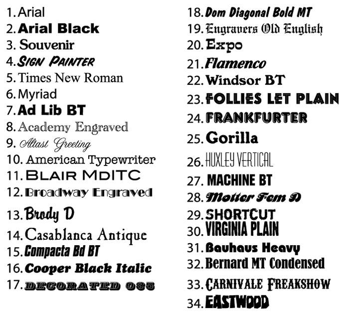
Choosing the right Font: Why Typography Matters More Than You Think
When it comes to web design, the choice of font is often overlooked, yet it plays a pivotal role in user experience and brand perception. A well-selected typeface can enhance readability, convey a specific mood, and even influence user behavior. here are a few reasons why typography matters more than you think:
- First Impressions Matter: The moment a visitor lands on your site, the font choice contributes to their first impression. A modern, clean font can convey professionalism, while a playful script might evoke creativity. Your typography should align with your brand’s personality.
- Readability is Key: No matter how visually appealing your website is, if the text is difficult to read, users will quickly lose interest.Prioritize legibility by selecting fonts that are easy on the eyes, taking into account size, spacing, and contrast with the background.
- Establish a Visual Hierarchy: Typography can guide users through your content. By varying font sizes, weights, and styles, you can highlight important information and create a natural flow that enhances user engagement.
- Brand Consistency: The fonts you choose can reinforce your brand identity. sticking to a limited set of fonts across your site can create a cohesive look that strengthens brand recognition. This consistency helps build trust with your audience.
To illustrate the impact of font choices,consider the following comparison of popular font styles:
| font Style | Best Used For | Emotional Impact |
|---|---|---|
| Sans Serif | Modern websites,tech companies | Clean,professional |
| Serif | publications,law firms | trustworthy,stable |
| Script | Weddings,creative industries | Elegant,personal |
| display | Unique branding,headlines | Bold,attention-grabbing |
Remember,the aesthetic choices you make when designing your website are not just for decoration; they are integral to communicating your brand’s message. A thoughtful combination of background colors, imagery, and typography can create an immersive experience that resonates with users, encouraging them to stay longer and explore more. By prioritizing typography, you’re not just choosing a font; you’re crafting an experience that reflects your brand identity and captivates your audience.
Color Theory Essentials: Elevate Your Websites Aesthetic Appeal
Choosing the right colors for your website is more than just about aesthetics; it’s about creating an emotional connection with your audience. A well-thought-out color palette can enhance user experience and guide visitors through your content seamlessly. Consider how colors can evoke feelings—blue often communicates trust, while red can evoke excitement. By mixing different shades and tones, you can craft a unique atmosphere that aligns with your brand identity.
When selecting a background color, remember that it sets the foundation for everything else on your site. A soft, neutral background can make your content easier to read, while a vibrant background can help certain elements pop. Here are some essential tips for creating an effective background:
- Contrast: Ensure sufficient contrast between text and background for readability.
- Consistency: Stick to a limited color palette to maintain visual harmony.
- Texture: Consider adding subtle textures to add depth without overwhelming users.
The choice of font is equally crucial to your site’s aesthetic appeal. Typography conveys personality and helps establish your brand voice. Here are some factors to think about:
- Legibility: Choose fonts that are easy to read across devices and screen sizes.
- Hierarchy: Use different font sizes and weights to guide users through your content.
- Personality: Match the font style to your brand identity—serif fonts for tradition, sans-serif for modernity.
| Font Type | Best Use | Example |
|---|---|---|
| Serif | Formal or Customary | Times New Roman |
| Sans-serif | Modern and Clean | Arial |
| Script | Creative and Personal | Pacifico |
Incorporating other aesthetic options like imagery, icons, and whitespace can further enhance the overall look and functionality of your website. Using high-quality images can draw users in and create a visual narrative, while icons can help communicate ideas quickly. Whitespace, or negative space, is equally critical; it allows your design to breathe and can help guide the user’s focus to important elements. When used effectively, these elements can elevate your website from merely functional to aesthetically pleasing.

Balancing Text and Background: Creating Readable and Attractive Designs
When it comes to web design, the interplay between text and background is crucial in creating a visually appealing and readable experience. choosing the right background color or image can either enhance or detract from your content. A well-selected background can make your text pop, while a poor choice can lead to frustration for your visitors. It’s essential to consider color contrast, which can significantly affect readability.
For instance, a light background with dark text is often easier to read than a dark background with light text, especially for users with visual impairments. Here are a few tips to keep in mind:
- Contrast is Key: Ensure that your text stands out against the background.
- Subtle Patterns: If you want to use a patterned background, keep it subtle to avoid overwhelming your text.
- Light and Dark Themes: Consider offering a toggle option between light and dark modes for user preference.
Font choice is just as important as background selection.The right font can convey your brand’s personality, while the wrong one can confuse or frustrate your audience. When choosing fonts, aim for:
- Readability: Use clear, legible fonts for body text.
- Pairing Fonts: Combine a decorative font for headings with a simple font for body text.
- Limit Styles: Stick to two or three font styles to maintain a cohesive look.
| Font Type | Best For | Example |
|---|---|---|
| Serif | Formal Content | Times New Roman |
| Sans Serif | Casual and modern | Arial |
| Display | Headings and Logos | Pacifico |
don’t overlook the impact of whitespace. Adequate spacing around text and images not only improves readability but also allows your design to breathe. A cluttered layout can distract users and diminish the effectiveness of your message. By thoughtfully applying these principles, you can create a harmonious balance that delights the eyes and engages your audience.
Utilizing White Space: the Secret Ingredient to a Clean Look
In the world of web design, achieving a clean, professional look is often hinged on how effectively you utilize the space around your content. White space, often referred to as negative space, is not merely an absence of content; it serves as a vital component that enhances readability and visual appeal. by strategically incorporating white space, you allow your audience to breathe, reducing clutter and enabling them to focus on the essential elements of your website.
When designing your layout, consider the following benefits of white space:
- Improved Readability: Adequate spacing between text blocks and images makes it easier for users to read and comprehend your content.
- Enhanced Focus: By isolating key elements, such as calls to action or critically important messages, white space draws attention where it is indeed needed moast.
- Visual Hierarchy: Proper use of space helps to establish a clear visual hierarchy, guiding users naturally through the content.
Consider a layout that balances text,images,and white space. An effective approach is to employ a grid system that allows you to allocate space wisely. For instance, you might use larger margins around text sections or increase line spacing for better clarity. The goal is to create an inviting atmosphere that encourages interaction.
| Element | White Space Usage | Effect |
|---|---|---|
| Headings | Increase margin above and below | Creates emphasis and separates sections |
| Images | Use padding around images | Prevents clutter and enhances aesthetics |
| Paragraphs | Add line height and spacing | Improves readability and comfort |
Ultimately, the key to effective design lies not just in the elements you include, but also in the space you leave untouched. By embracing white space, you create a clean, modern look that resonates with users, allowing them to navigate your site effortlessly. So,when planning your next web project,remember that less can indeed be more; sometimes,the most impactful designs are those that allow for ample breathing room.

Imagery Matters: How Background Images Can Enhance or Distract
When designing a website, the choice of background imagery can significantly alter the user experience. A well-chosen background can serve as a seamless canvas that enhances your content, while a poorly selected one can detract from the message you’re trying to convey. It’s essential to consider how the background interacts with your text and other design elements.
Here are some key factors to consider when selecting background images:
- Relevance: Ensure that the imagery aligns with your brand message and content theme. A background that resonates with your audience will create a more engaging experience.
- Contrast: Choose images that offer sufficient contrast with your text. If the background is too busy or dark,it may lead to readability issues.
- Consistency: Maintain a consistent visual style across all pages. This helps in creating a cohesive brand identity that users can easily recognize.
Another critical aspect of background images is their ability to evoke emotions. Images can tell a story or set a mood,influencing how users perceive your website. For instance, a serene landscape can promote a feeling of calm, while a vibrant cityscape may inspire energy and dynamism. it’s critically important to think about the emotional journey you want your users to embark on.
| Type of Background | Impact on User Experience |
|---|---|
| Minimalist Designs | Promotes clarity and focus on content |
| Textured Backgrounds | Adds depth and interest,but can be distracting |
| Full-Width Images | Creates an immersive experience but may overwhelm the content |
Ultimately,the goal is to find a balance where the background complements rather than competes with your core message. Frequent testing and user feedback can be invaluable in fine-tuning the imagery that best enhances your website’s aesthetics and usability.
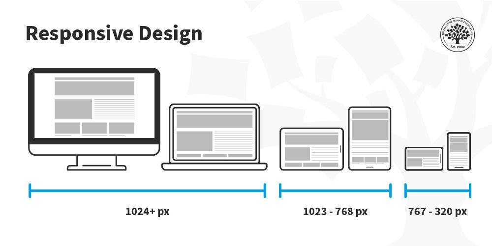
Responsive Design: Making Aesthetics Work on All Devices
In today’s digital landscape, creating a visually appealing website that looks good on all devices is essential.Whether your audience is browsing on a smartphone, tablet, or desktop, their experience should be seamless and engaging. To achieve this,it’s crucial to consider how backgrounds,fonts,and other aesthetic elements work together in a responsive design.
One of the most impactful choices you can make is the background. A well-chosen background not only sets the tone for your website but also enhances readability and user experience. Consider these options:
- Solid Colors: clean and simple, perfect for creating a professional look.
- Gradients: Adds depth and visual interest without being overwhelming.
- Images: Ensure they are high-quality and optimized for fast loading; blurry or pixelated images can drive users away.
- Patterns: Subtle patterns can provide a unique flair, but should remain understated to avoid distraction.
Equally important is your choice of font. typography can make or break your website’s aesthetic appeal.Here’s how to select the right fonts:
- Readability: Use fonts that are easy to read on all devices.
- Brand Consistency: Choose fonts that reflect your brand’s personality.
- hierarchy: Utilize different font sizes and weights to guide users through your content.
Moreover, don’t underestimate the power of white space. Effective use of white space improves clarity and draws attention to essential elements, enhancing the overall user experience. It can also help mitigate clutter, making your website feel more spacious and organized.
consider creating a responsive design table that showcases how various aesthetic elements change across devices. By testing different backgrounds and fonts, you can ensure that your design translates well on any screen size.
| Device | Background Option | Font style |
|---|---|---|
| Mobile | Solid Color | Sans-serif |
| Tablet | Gradient | Serif |
| Desktop | Image | Display Font |
consistency is Key: Aligning Aesthetic Choices with your Brand Identity
When it comes to designing a website, every element contributes to your brand’s story, and aesthetics play a pivotal role.The background,font,and other design choices should resonate with your brand identity,creating a cohesive visual experience. This alignment is crucial to ensure that your message is not only heard but felt. Here are some considerations to keep in mind:
- Background Selection: Your background sets the stage for your content. Choose colors and textures that reflect your brand’s personality. For instance, a tech company might opt for sleek, minimalistic designs, while a boutique might favor warm, inviting backgrounds.
- Font Choices: Typography isn’t just about readability; it’s about conveying tone. A playful font may work for a children’s brand, while a serif font could lend sophistication to a law firm’s website. consistency in font usage across headings, body text, and calls to action reinforces your brand’s voice.
- Image Style: The types of images you use should align with your overall aesthetic.Whether you’re using illustrations, photography, or graphics, ensure they reflect the essence of your brand. A unified image style builds familiarity and trust with visitors.
- Color Palette: Develop a color palette that mirrors your brand identity. Limit your palette to a few primary colors and a couple of accent colors to maintain visual harmony. Colors evoke emotions, so choose wisely to resonate with your target audience.
| Element | Brand Example | Aesthetic Choice |
|---|---|---|
| Background | Nature Brand | Earthy tones and textures |
| Font | Luxury Brand | Elegant serif fonts |
| Images | Tech Company | Futuristic and clean visuals |
| Color Palette | Children’s Toy Brand | Luminous and playful colors |
Ultimately, your website should serve as an extension of your brand. When aesthetics are thoughtfully aligned with your identity, you create a seamless experience for your visitors. This not only keeps them engaged but also enhances your brand’s credibility and fosters loyalty. In the competitive digital landscape, a consistent visual language can set you apart and make your brand memorable.

Testing and Feedback: Fine-Tuning Your Design for Maximum Impact
Designing a website is a dynamic process that thrives on continuous improvement. Once you’ve established the initial aesthetics—such as background colors, font choices, and visual elements—it’s essential to test these elements in real-world scenarios. Gathering feedback from users not only helps refine your design but also ensures that it resonates with your target audience.
Consider implementing tools like A/B testing to compare different design elements and their impact on user engagement. This method allows you to test two or more versions of a webpage to determine which one performs better concerning user interaction and conversion rates. By monitoring metrics such as click-through rates, bounce rates, and time spent on page, you can make informed decisions about which design choices hit the mark.
Moreover, leveraging user feedback is invaluable. Here are some effective ways to gather insights:
- Surveys and Polls: Use pop-up forms or embedded surveys on your site to ask your audience about their experience with your design.
- User Testing Sessions: Conduct live testing with a group of users to observe their interactions and gather qualitative feedback.
- Analytics Tools: Utilize tools like Google Analytics to track user behavior and identify areas of improvement.
To illustrate the impact of design choices, consider creating a simple feedback table that summarizes user preferences:
| User Preference | Rating (1-5) | Comments |
|---|---|---|
| Background Color | 4 | Calming and professional! |
| Font Style | 3 | Could be more modern. |
| Overall Aesthetic | 5 | Very appealing! |
Fine-tuning your design based on actual user feedback not only enhances the visual appeal but also significantly improves user experience.As you iterate on your design, keep an open mind and be willing to adjust your aesthetic choices to align with user expectations and preferences.remember,the ultimate goal is to create a website that not only looks great but functions flawlessly,driving user engagement and achieving your business objectives.

Staying Current: Trends in Aesthetic Design You Cant ignore
In today’s fast-paced digital world, staying ahead of aesthetic design trends is more critical than ever. Websites are frequently enough the first point of contact for potential customers, and the way a site looks can significantly impact user experience. an appealing background, carefully chosen fonts, and thoughtful design elements can help create an engaging atmosphere that resonates with visitors.
Backgrounds: The choice of background can either enhance or detract from your website’s overall aesthetic.Consider incorporating:
- Gradients: They add depth and dimension, creating visual interest.
- Textures: Subtle textures can make a background more engaging without overwhelming the content.
- bold Images: High-quality images can evoke emotions and create a lasting impression.
Using backgrounds that align with your brand identity not only captures attention but also sets the tone for the entire site.
Font Selection: The font you choose can speak volumes about your brand’s personality. It’s crucial to select fonts that are not just stylish but also easy to read. When selecting fonts, keep these trends in mind:
- Serif Fonts: Often seen as traditional and reliable, they are perfect for brands wanting to appear trustworthy.
- Sans-serif Fonts: These are modern and amiable,making them ideal for tech-forward companies.
- Custom Fonts: Unique, custom typefaces can elevate your brand’s identity and set you apart from competitors.
Moreover, consider the hierarchy in your typography. Use different sizes and weights to draw attention to essential elements, guiding users through your content seamlessly.A well-structured typography strategy can significantly enhance user engagement.
Color Schemes: Color is a powerful tool in design that can influence emotions and behaviors. When planning your color scheme, think about:
- Brand Colors: integrate your brand’s colors to maintain consistency across platforms.
- Contrasting colors: Use contrasting colors for text and background to improve readability.
- Seasonal Trends: Stay aware of trending colors, as they can refresh your website’s look and keep it modern.
| Element | Trend | Impact |
|---|---|---|
| Background | Gradients | Adds depth |
| Font | Custom Fonts | Enhances uniqueness |
| Color | Contrasting Colors | Improves readability |
incorporating these elements thoughtfully can lead to a cohesive, aesthetic design that not only attracts but also retains users. By paying attention to backgrounds, fonts, and colors, you ensure that your website is not just visually appealing but also functional and reflective of your brand’s values.
frequently Asked Questions (FAQ)
Q: Why is background choice so important in web design?
A: the background of a website sets the tone for your entire design. It’s like the canvas for a painting; it can either enhance your content or distract from it. Choosing the right background color or image can create an emotional connection with your audience,guiding their experience and making them feel welcome. A clean, appealing background ensures that your content stands out and is easy to read, which is crucial for keeping visitors engaged.
Q: How does font selection impact user experience?
A: Font selection is one of the most underrated aspects of web design. The right font can enhance readability and convey your brand’s personality. As a notable example, a fun, quirky font might be perfect for a children’s website, while a sleek, modern font works well for a tech company. additionally, using too many different fonts can create visual chaos. Sticking to two or three complementary fonts keeps your site looking clean and professional.
Q: What are some common mistakes people make with backgrounds and fonts?
A: One common mistake is using backgrounds that clash with text,making it hard to read. Light text on a light background or dark text on a dark background can frustrate users. Using trendy fonts that lack readability is another pitfall. Always ensure that your fonts are legible across various devices and sizes.And remember, while it’s tempting to use multiple fonts to show creativity, consistency is key!
Q: How can color scheme influence a website’s aesthetics?
A: Color scheme plays a huge role in evoking emotions and guiding user behavior. different colors can invoke different feelings; for example, blue often conveys trust, while red can create urgency. A harmonious color palette also contributes to a cohesive design. When your colors complement each other, they create a more visually appealing experience, encouraging visitors to stay longer and explore more.
Q: Can you give tips on how to choose the right aesthetic options?
A: Absolutely! Start by defining your brand personality—what message do you want to convey? Once you have that, consider your target audience: what appeals to them? Use color theory as a guide and test combinations to see what feels right. For fonts, prioritize readability and pair fonts that complement each other. Don’t hesitate to get feedback from others; sometimes, a fresh set of eyes can catch things you might overlook!
Q: how can I ensure my website design remains accessible to all users?
A: Accessibility should be a priority in your design. Use high-contrast colors for text and backgrounds to ensure readability for those with visual impairments. Opt for web-safe fonts and avoid using small font sizes. It’s also beneficial to provide choice text for images. Testing your website with accessibility tools can help identify areas that need improvement, ensuring everyone can enjoy your content.
Q: What’s the bottom line when it comes to aesthetic choices in web design?
A: The bottom line is that your aesthetic choices are crucial to your website’s success. They not only reflect your brand identity but also enhance user experience. By thoughtfully selecting backgrounds, fonts, and colors, you create a welcoming atmosphere that encourages visitors to engage with your content. So take the time to experiment, gather feedback, and refine your choices—you’ll be glad you did!
In Summary
as you embark on your website design journey, remember that every detail matters—from the background hues to the font styles. These aesthetic choices aren’t just about looking good; they play a crucial role in how users experience your site and engage with your content. A well-thought-out design can enhance readability, convey your brand’s personality, and ultimately drive conversions.
So, take the time to experiment with different options, gather feedback, and refine your choices. Don’t hesitate to get creative! Your website is a reflection of you and your brand, so make it count.
As you move forward, keep this in mind: the right aesthetic can turn casual visitors into loyal followers. Let your design tell your story, captivate your audience, and inspire action. Happy designing!